Explorations in VR Design is a journey through the bleeding edge of VR design – from architecting a space, to designing groundbreaking interactions, to making users feel powerful.
Virtual reality is a world of specters, filled with sights and sounds that offer no physical resistance when you reach towards them. This means that any interactive design with hands in VR has to contend with a new version of one of the world’s oldest paradoxes. What happens when an unstoppable force (your hand) meets an imaginary digital object?
Explore our latest XR guidelines →
In traditional desktop and console gaming, human movement is often arbitrarily limited. Your character can encounter unswimmable water or run up against a wall, and you don’t think twice about it. But in VR, human movement cannot be arbitrarily limited in VR without resulting in a disastrous loss of immersion. The conventional boundaries of traditional game design no longer apply.
In some cases, like walls or tables, we can address this challenge by having the hands simply phase through virtual matter. But that’s not why we want hands in VR. The user’s very presence within the scene creates the expectation that things can be interacted with. Touchless interaction in VR is an unprecedented design challenge that requires a human-centered solution.
This is the philosophy behind the Leap Motion Interaction Engine, which is built to handle low-level physics interactions and make them feel familiar. The Interaction Engine makes it possible for you to reach out and grab an object, and it responds. Grabbing it in your hand, your fingers phase through the material, but it still feels real. You can grab objects of a variety of shapes and textures, as well as multiple objects near each other that would otherwise be ambiguous.
This kind of experience is deceptively simple. But when these basic physical interactions are done right, they can prove more powerful and compelling than explosive graphics or exquisite world design – because they can disrupt the player’s expectations and take them to surprising new places. In this exploration, we’ll look at the physical and interactive design of objects in VR. Many of these principles also apply to user interface design, which is handled in next week’s exploration.
Building Affordances
In the field of industrial design, “affordances” refers to the physical characteristics of an object that guide the user in using that object. These aspects are related to (but distinct from) the aspects indicating what functions will be performed by the object when operated by the user. Well-designed tools afford their intended operation and negatively afford improper use.
The classic example of an affordance is the handle on a teapot, which is designed to be easy to hold, and exists to prevent people from scorching their fingers. Conversely, the spout is not designed to appear grabbable. In computer interface design, an indentation around a button is an affordance that indicates that it can be moved independently of its surroundings by pressing. The color, shape, and label of a button advertise its function. (Learn more in our post What Do VR Interfaces and Teapots Have in Common?)
Solid affordances are critical in VR interactive design. They ensure that your users understand what they can do, and make it easier for you to anticipate how your demo will be used. The more specific the interaction, the more specific the affordance should appear. In other words, the right affordance can only be used in one way. This effectively “tricks” the user into making the right movements. In turn, this makes the object easier to use, and reduces the chance of error.
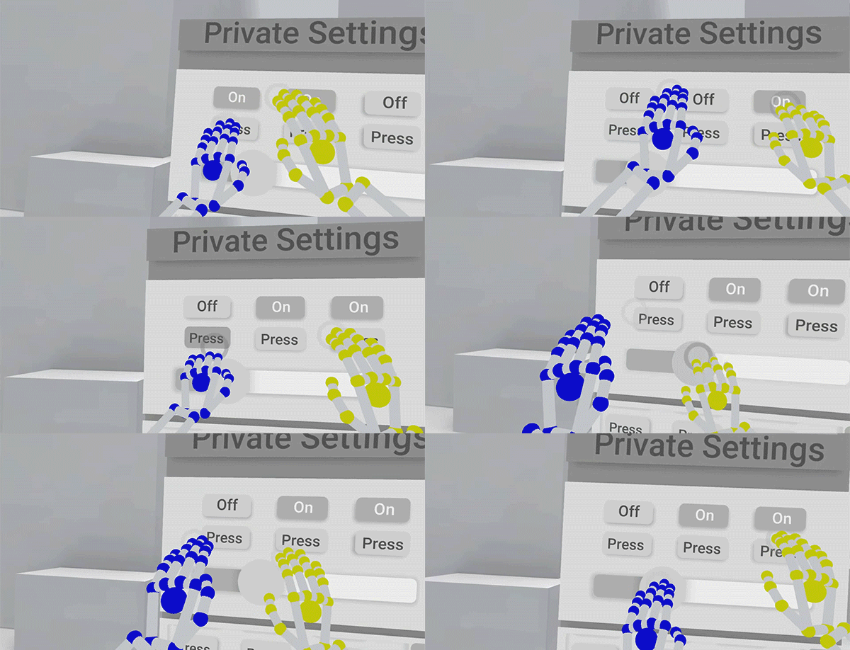
For example, a dimensional button indicates to the user to interact with the affordance by pushing it in (just like a real world button). If the button moves expectedly inward when the user presses the button, the user knows they have successfully completed the interaction. If however, the button does not move on press, the user will think they haven’t completed the interaction.
For inspiration, look for real-world affordances that you can reflect in your own projects. There are affordances everywhere around you, and these have often been appropriated by digital designers in making their creations easier to use. Below are a few examples.
Baseballs and Bowling Balls
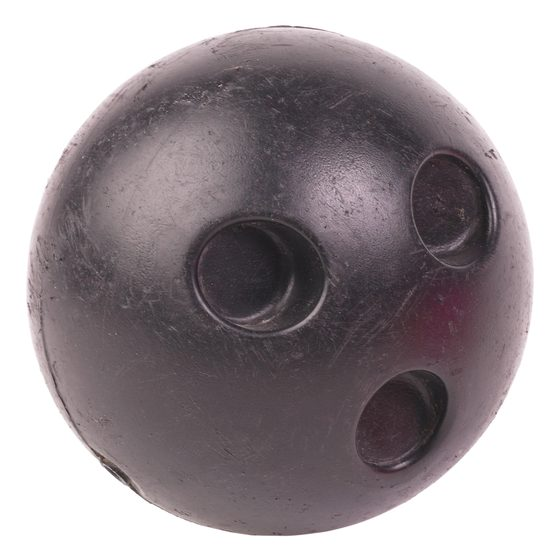
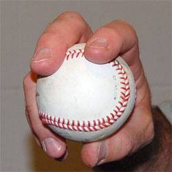
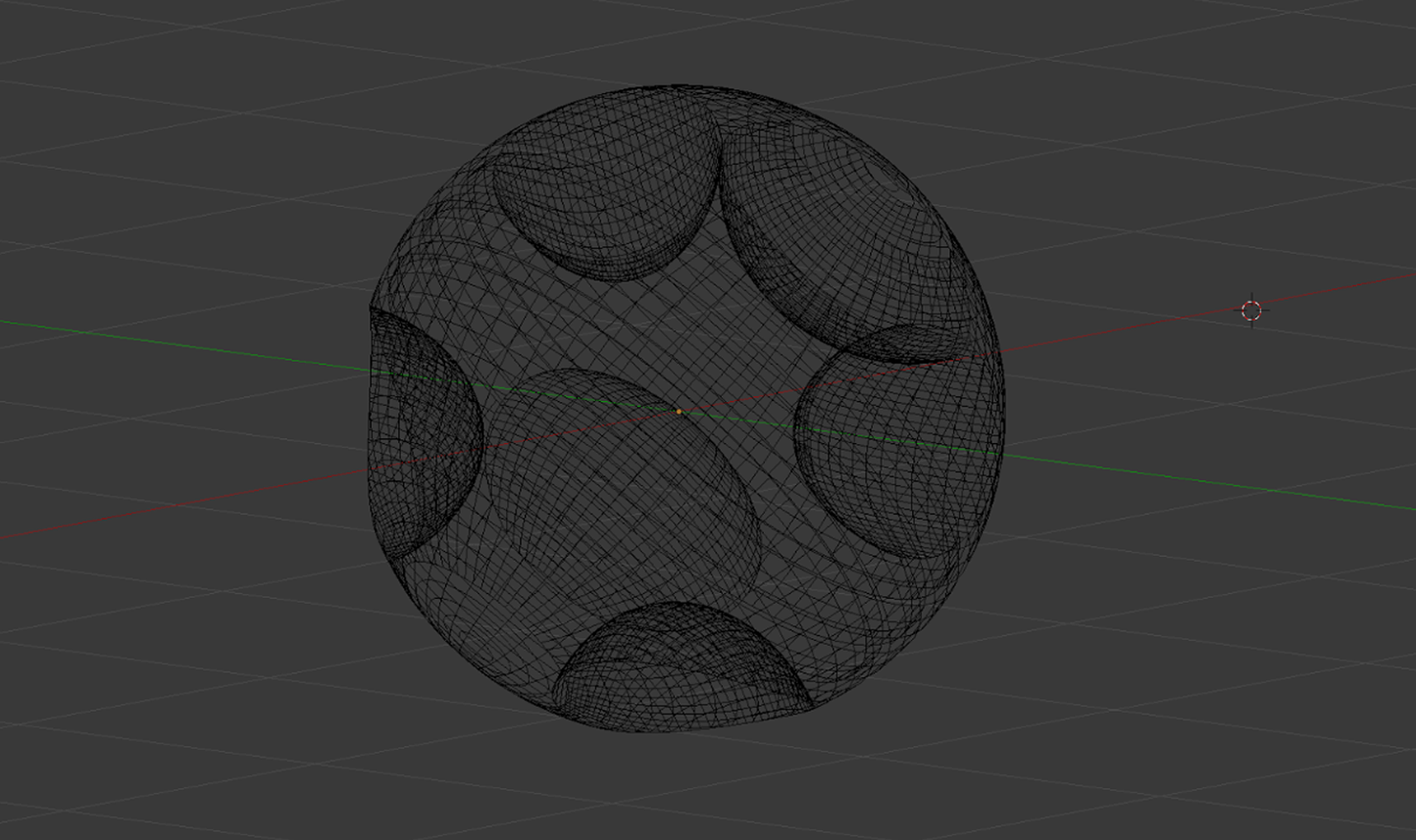
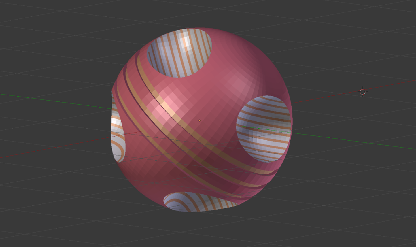
In designing Weightless: Remastered, Martin Schubert found that everyone tends to grab basic shapes in different ways – from holding them lightly, to closing their fists through them. He took inspiration from baseballs and bowling balls to suggest how the projectiles in the Training Room should be held.
This led to a much higher rate of users grabbing by placing their fingers in the indents, making it much easier to successfully release the projectiles.
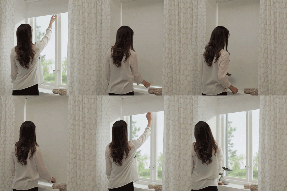 Window Blinds
To close some types of blinds, you reach up and pull them down over the window. In a similar way, the Notification Center on iOS can be summoned by dragging it down from the top of the screen. The similarity of these interactions suggests that the Notification Center is a temporary state that can be drawn out and retracted at will. This would also be a good foundation for a pinch-based interaction.
Doorknobs and Push Bars
Doorknobs fit comfortably in the palm of your hand, while push bars have wide surfaces made for pressing against. Even without thinking, you know to twist a doorknob. In both cases, the objects are firmly attached to the door, suggesting that the interaction does not involve removing them from the door.
Skateboard Prevention Measures
Ever seen small stubs along outdoor railings? These are nearly invisible to anyone who doesn’t want to grind down the rail – but skaters will find them irritating and go elsewhere. You might want to include negative affordances that guide users away from certain interactions.
Mouse Buttons vs. Touch Buttons
Mouse-activated buttons look small enough to be hit with your mouse, while touchscreen buttons are big enough to be hit with your finger. The size of an object or its constituent parts can suggest what kinds of physical interactions will work with it.
Everything Should Be Reactive
People enjoy playing with game physics, pushing the boundaries and seeing what’s possible. We start this as babies, playing with objects to gain an understanding of how real-world physics work. Physics interactions help you build a mental model of the universe and feel that you have agency within it.
With that in mind, every interactive object should respond to any casual movement. This is especially true with any object that the user might pick up and look at, since people love to pick up and play with tools and other objects. As Matthew Hales points out in Hands in VR: The Implications of Grasp, “Like a typical two-year-old, if [the player] can reach it, they will grab it, and when they grab it they are likely to inspect it closely…. Objects within the near zone trigger our innate desire to examine, manipulate, and assess for future utility.”
I Expect You To Die creator Jesse Schell reached a similar conclusion when he wrote on Gamasutra that “you are wiser to create a small game with rich object interactions than a big game with weak ones.” (See also Fast Co. Design’s piece Google’s 3 Rules For Designing Virtual Reality and the Daydream Labs talk at Google I/O 2016 for insights on designing delightful or impossible interactions for hands.
When done effectively, people will feel themselves anticipating tactile experiences as they interact with a scene. However, if an object appears intangible, people have no mental model for it, and will not be as able to reliably interact with it.
Taken a step further, you might want to make certain elements of the experience responsive to the user’s gaze. This reduces visual clutter and reinforces which elements of the scene are fully interactive. (We did this with the sci-fi menus in our VR Cockpit demo. See also Jonathan Ravasz’s post Design Practices in Virtual Reality.)
Hand-Occluded Objects
In the real world, people routinely interact with objects that are obscured by their hands. Normally, this is achieved by using touch to provide feedback. In the absence of touch, here are some techniques that you can use:
- Provide audio cues to indicate when an interaction is taking place.
- Make the user’s hand semi-transparent when near UI elements.
- Make objects large enough to be seen around the user’s hand and fingers
- Avoid placing objects too high in the scene, as this forces users to raise their hands up and block their view.
- When designing hand interactions, consider the user’s perspective by looking at your own hands in VR.
Above all, it’s essential to dream big and look beyond. Unbounded by the laws of gravity, objects in VR can take any form we choose. Design cues can extend far beyond traditional game design, and into the physical world – retail spaces and magazines, origami and physical interfaces. This is industrial design on a digital scale, and it’s bigger than we ever imagined.
Explore our latest XR guidelines →
It’s time for designers to think beyond skeuomorphs and flat design, and towards essential cues inspired by how humans understand the world. Next week’s exploration dives into user interface design.

