Hand tracking and virtual reality are both emerging technologies, and combining the two into a fluid and seamless experience can be a real challenge. This month, we’re exploring the bleeding edge of VR design with a closer look at our VR Best Practices Guidelines.
Jody Medich is a UX designer and researcher who believes that the next giant leap in technology involves devices and interfaces that can “speak human.” In this essay, she asks how a 3D user interface could let us unlock our brainpower in new ways.
As three-dimensional creatures, humans need space to think. Many parts of our brains contribute spatial information to a constantly evolving mental map of our surroundings. This spatial memory enables us to understand where one object is in relation to another, how to navigate through the world, and provides shortcuts through spatial cognition. In turn, this frees up more working memory or short-term memory – the faculty that provides temporary storage and processing power for the task at hand.
Why Space?
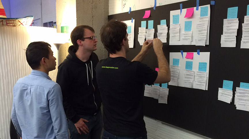
Spatial Semantics. Physical space allows users to spatially arrange objects in order to make sense of data and its meaning, thereby revealing relationships and making connections. Imagine a furious ideation sticky-note session. As participants add data to the wall, sticky notes appear in thematic groupings spatially across the board. Up close, we can see the individual interrelated data points. From a step back, we gain perspective on the overall structure of information. The way the space is organized provides the semantic structure we need to make sense of the information. This is true for sticky notes as well as for our rooms, our homes, our cities, and the world at large.
External Memory. Allowing space for external memory compensates for humans’ limited working memory, allowing people to see more detail and to keep information accessible and visually available. The note to buy milk on the fridge, the family photos stuck in the mirror, and putting “must remember” items near the car keys are all examples of spatial external memory.
Dimension. Without thinking, we can immediately tell the difference between two objects based on dimension and other cues. Through their dimensionality, we can innately understand information about either object without having to use much working memory in the process.
Problem: 2D Computing is Flat
With modern operating systems, interaction designers create shells based on a “magic piece of paper” metaphor. Essentially, this means that the OS works like a series of 2D planes that switch, slide, or blend into each other.
Unfortunately, this creates a very limited sense of space and effectively prevents the development of spatial cognition. While smartphones and tablets have made attempts at spatial organization systems with “carousels,” the map space is limited and does not allow for productivity scenarios. For instance, I cannot work on large presentations or content creation on a tablet, as the OS is not extensible to those types of tasks.
Contemporary desktop shells are even more nebulous and do not provide opportunities for spatial cognition – forcing users to spend working memory on menial tasks. Organization is chiefly based on filenames rather than spatial semantics, while properties are mapped only in one dimension at a time. This makes it impossible to tell the difference between items based on multiple dimensions, and severely limits opportunities to visually sort, remember, and access data.
In practice, this complete lack of spatial mapping demands cognitive-heavy task switching from users. Because there is no spatial memory – no spatial cognition of the digital space – the user must expend their precious working memory. It is up to the user to understand how the data has been structured and how to retrieve it. Each user must develop workarounds to quickly access files and move between seemingly related tasks (e.g. alt-tab, naming conventions, etc.).
As a result, every interaction with the OS is an interruption, often requiring many traversals to achieve a goal. These include:
- Launching a new app
- Closing an app to move to another activity
- Finding an item
- Accessing the file browser
- Changing windows across apps
- Actions that cause a new window/screen in an app
- Notifications/conversations
These interruptions are extremely costly to productivity and flow. Throughout the workday, the average user switches tasks three times per minute, and once distracted, it may take anywhere from 30 seconds to half an hour to resume the original task. If every OS interaction represents an interruption, whether great or small, imagine how much collective time is lost to overcoming technological interfaces.
Opportunity: Bringing Spatial Cognition into VR
Based on Hick’s Law (1952), any interface is vastly improved through the reduction of the number of choices, thereby improving the signal-to-noise ratio [expressed as T = blog2(n + 1)]. Likewise, reducing traversal time between objects will naturally improve efficiency (Fitt’s Law). With the rise of augmented and virtual reality (AR/VR), this can finally be achieved by providing opportunities for spatial cognition.
AR/VR is inherently spatial, offering a much larger and richer surface for the spatial arrangement of tasks. And spatial memory is free – even in virtual worlds.
Even now, we are seeing marked increased productivity on larger screens, which allow users to spatially arrange tasks. Czerwinski et al. demonstrated that spatial tasks were significantly improved for women on displays with large fields of view, with AR/VR providing the ultimate open space.
In general, the more space users have available, the more windows and tabs they can open; multi-tasking with a turn of the head rather than a cognitively heavy interaction with the OS. As Andrews et al. point out, “comparisons can be done visually, rather than relying on memory and imperfect internal models.” Meanwhile, Ball et al. proved that physical interaction further improved the way users understand and use virtual space, just as it does in real environments.
So how do we accomplish this? Let us start by building on a digital property that already has an underlying spatial system: the browser.
Desktop Space and the Browser
The modern Internet browser is a digital task-switching haven, designed to allow users to access and explore vast amounts of content. For that reason, it already has a baseline spatial structure, built on the tab (resembling a card) and window (deck of cards).
Spatial Semantics
Users combine tabs spatially, grouping like tabs into windows. Within groupings, certain tabs, such as search engines, social networks, and content providers, act as launchers for new tabs. These tabs load to the right of the launcher tab, but before the next launcher tab – creating a spatial structure from left to right, with the tab generators as landmarks. The resulting spatial map provides a sort of timeline, and a method for keeping track of content, as tabs allow users to:
- spatially arrange their content
- put aside a piece of content to revisit later
- set reminders for necessary tasks/activities
- keep their place in a document, even when branching from the initial window
- engage in parallel browsing across multiple tabs while maintaining multiple back stacks (each tab has its own history)
- group similar tasks and tabs for sub-tasks (e.g. one window with multiple social networks or emails open)
- leave page open for a long time over multiple sessions with the intention of returning to them.
- use greater screen space to open more tabs.
The tab was a major step forward in the evolution of the browser, largely replacing the Back button and opening up new possibilities for content exploration. This is because, unlike abstract pages lurking in the browser history, tabs have spatial presence:
- The back button can require too many (or an unknown number) of clicks to return to a desired page.
- While an open tab maintains state, the back button requires the page to reload.
- The browser history (from right-clicking on the Back button) requires users to navigate via link name, while tabs allow users to navigate via spatial relationship or visual browsing.
As mentioned previously, the restricted space of mobile device screens often inhibits our ability to access spatial cognition. This issue is just another example – on mobile devices, where tabs are not available, users rely heavily on the back button and new windows. This slows down their ability to navigate between various pages.
External Memory
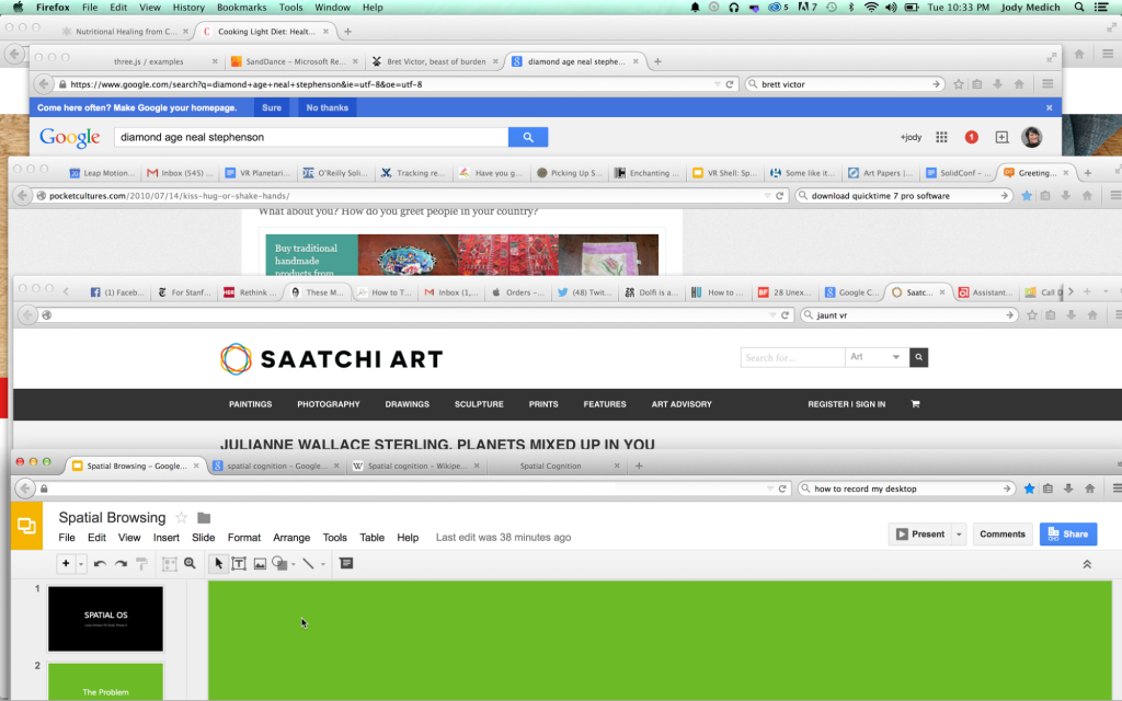
Like many people, I leave tabs open like “don’t forget” notes on a mirror. These tabs are important – reminding me of tasks I need to do, articles I want to read, and funny videos that I will never get around to watching. Browsers often serve as a user’s active memory, and so it is very important that users be able to easily and accurately jump to any given element quickly and reliably.
Studies show that the more windows and tabs a user has open, the more important the spatial relationships become. Temporal-based interactions (e.g. alt-tab) are far less helpful than spatial consistency even in today’s limited digital space, and spatial consistency in the configuration of tabs encourages re-visitation – even three months after use.
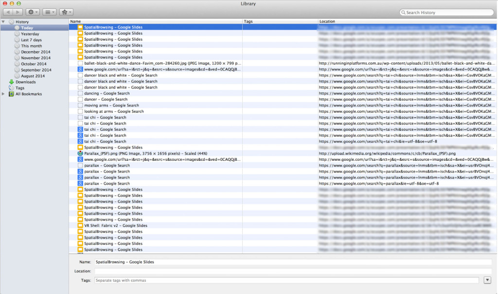
My browser history for today in Firefox.
The browser has an excellent spatial system, and yet when I look at my browsing history, I see a mess of links that are all given the same illegible data. As noted earlier, thanks to the emergence of tabs, many users engage in parallel browsing – following multiple strains of thought in different windows or tabs.
This generates a hodge podge history of activity, which is a nightmare to see in a single dimension like the one above. All the spatial data is lost along with the visual representation of the page, and all that is left is a short description and URL.
VR Space and the Browser
With AR/VR, we have the opportunity to increase and improve spatial cognition in the browser by developing a stronger spatial system and allowing for dynamic data dimensionality. With a strong sense of space, the user can quickly set up spatially optimized task flows. AR in particular creates opportunities for users to map their virtual spatial systems to their real ones – opening up rapid development of spatial cognition. In both cases, however, we have a theoretically infinite canvas to spread out.

Spatial Semantics
The key to a successful spatial browser is a strong baseline grid. To lean on users’ existing expectations based on over a decade of tab browsing, we can maintain the existing “launch tab to right” pattern. At the same time, allow users the full reach of their space to organize data into spatially relevant areas using simple drag-and-drop interactions over that baseline grid. Regardless of dynamic reshuffling of space, it is essential that this canvas retain the spatial location of each item until specifically altered by the user.
External Memory
With this spatial consistency, the user can maintain “memory tabs” and return to them through spatial memory. This also helps the user create muscle memory for frequent tasks and activities.
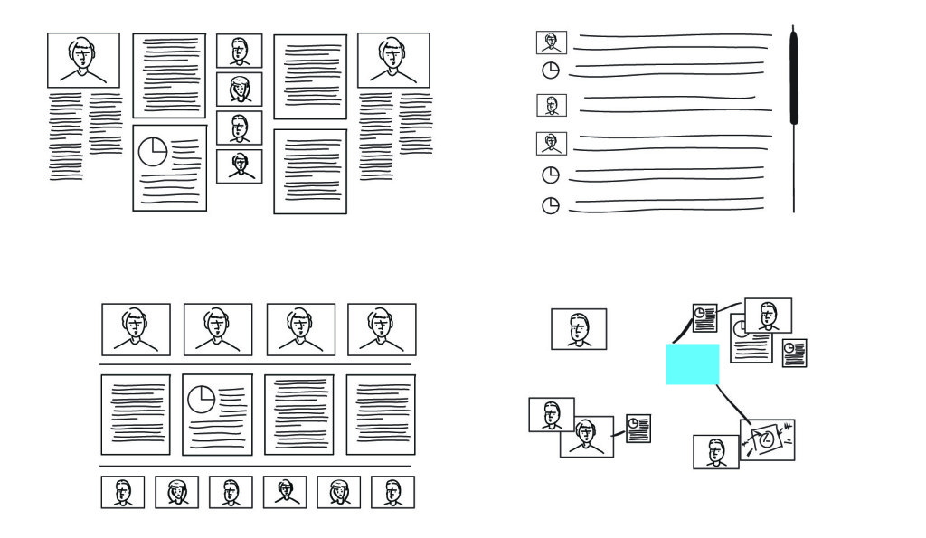
Dynamically re-sort objects spatially to reveal meaning. Sort methods clockwise from top left: timeline, alphabetical, type, user specified.
Dynamic Spatial Semantics
Now that the user can always return to their baseline spatial system, we can capitalize on the digital power of data by providing dynamic spatial semantics. Two projects from Microsoft, Pivot and SandDance, demonstrate the power of dynamic movement between data visualizations to reveal patterns within data. The animated transitions between the views help users understand the context.
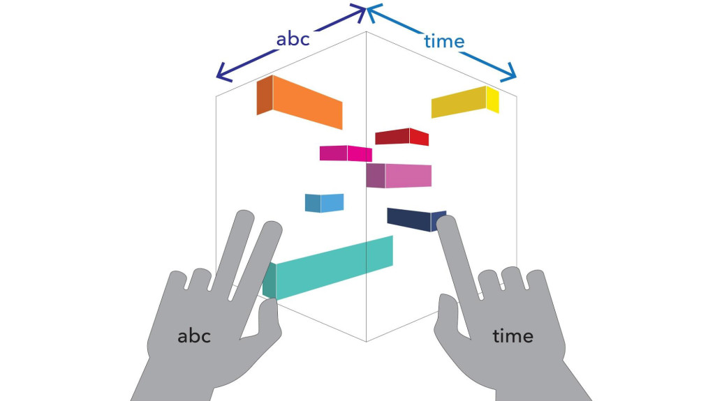
Dynamic Dimension: ABC x Time
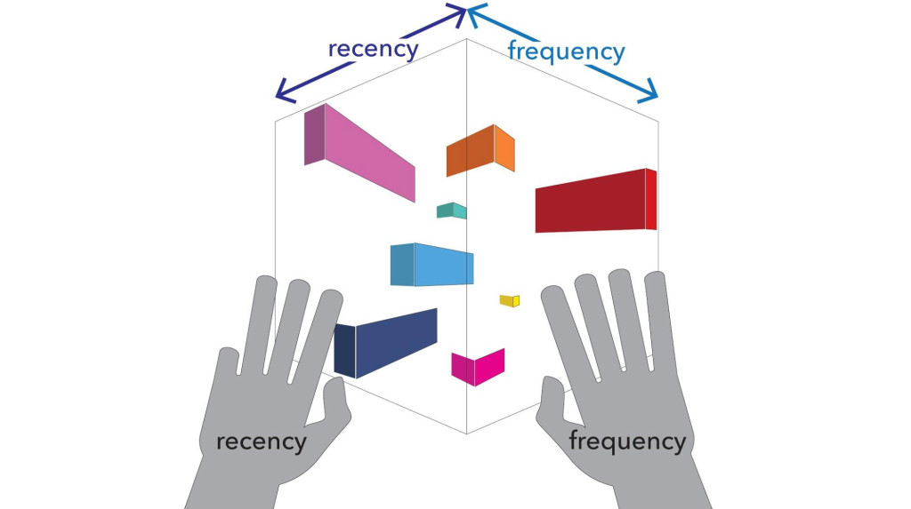
Dynamic Dimension: Recency x Frequency
Dynamic Dimensionality
However, both Pivot and SandDance were developed for screens – a 2D environment. While this reaches the limit of today’s shells, AR/VR offers us the opportunity to create 3D intersections of data visualizations. In other words, the intersection of two 2D data visualizations providing a 3D sense of data dimensionality. Data is given a dynamic volume as defined by the values of the intersecting graphs.
In practice, one application of this approach would be that items most related to the two visualizations become large and nearer to the user, while items that are not likely to be relevant fall away. In this way, by quickly looking at the dimensions involved, the user can instantly understand the difference between various items – just like in the real world.
Conclusion
The ability to see and understand the world in three dimensions is an extraordinarily powerful part of our everyday experience. In many ways, this has been lost with traditional digital interfaces, as UIs are inevitably shaped and limited by hardware capabilities. By unlocking the third dimension, VR/AR opens up the opportunity to combine spatial-cognitive tools and experiences with the raw power and infinite malleability of the digital medium.



[…] Pour consulter l’article, OS 3D […]
April 26, 2015 at 1:48 amExcellent article. Hopefully the ideas will be incorporated in the hololens project.
April 26, 2015 at 7:48 am[…] http://blog.leapmotion.com/truly-3d-operating-system-look-like/ […]
April 27, 2015 at 8:24 am[…] http://blog.leapmotion.com/truly-3d-operating-system-look-like/ […]
April 27, 2015 at 8:25 am[…] http://blog.leapmotion.com/truly-3d-operating-system-look-like/ […]
April 27, 2015 at 8:25 amRemembers me about the 3D desktop BumpTop, bought by Google in 2010. One great concept for a desktop.
April 28, 2015 at 9:08 amDave Small at the MIT Media Lab worked on similar concepts almost 20 years ago. Then Mike McCue and Paper Software did some VRML-based desktops if I remember correctly. Interesting to see these ideas resurface in context of Leap Motion. I think eye tracking will be the preferred input device though, waving hands around gets tiring quickly, at least for me (and I love my Leap).
April 28, 2015 at 10:19 amYou know what they say, everything old is new again 😀 Agreed that multi-modal combinations will be essential. We don’t think that the future of VR interactions is all hand tracking, all the time — just that it will be a core aspect.
April 28, 2015 at 10:40 amyep. old is new. and you know what they say about people who talk with their hands..)
November 6, 2015 at 4:11 pmNow, imagine we lived in a world where manipulating data in 3d was as easy as 2d.
Imagine that was the real world, via some sort of AR interface.
Allow a few generations to pass.
Would we still even write in pure 2D? Would the concept of fonts, glyphs etc adapt to express ideas in 3d space?
As humans we naturally make hand gestures, head motions, expressions. In some ways we reducing our communication bandwidth down to 2D media for a very long time.
April 28, 2015 at 1:36 pmAmazing stuff, but think that spatial elements could benefit from Gibson’s ecological viewpoint. Some great stuff by Aarseth (Games perspective) and Ingold (anthropology) extending this. Given the increasing interlinked social and environmental context of computing a deeper spatial structure could be beneficial to organising the relevance of information to a task or purpose. So many questions though, thanks for stimulation.
April 29, 2015 at 1:48 amPeople operate mainly in 2D with interpolated depth perception. 3D interfaces will likely always be forced to stay in a 2D centric layout, because our ability to resolve useful data from depth is far inferior to that of 2D. It’s possible people could begin to think in 3D, rather than 2D + Depth, but after testing 3D control schemes, I’ve realized 2D is the fastest way to interface, and 3D can only add so much.
(Of course, I’ll keep shooting 3D media, and playing 3D games, and making 3D VR, but I don’t see depth as being much of a game changer)
April 30, 2015 at 12:57 pm[…] real world, and the implications are staggering. Our brains are designed at a fundamental level to work in a 3D world, and VR can take advantage of this deep level of […]
May 15, 2015 at 8:28 am[…] opportunità di interazione nella realtà virtuale Immersive Design mentre Jody Medich ipotizza un 3D Os, entrambi gli approcci rappresentano due interessanti ipotesi per la VR user experience del […]
September 3, 2015 at 1:56 am[…] http://blog.leapmotion.com/truly-3d-operating-system-look-like/ […]
October 4, 2015 at 12:23 pm