Martin Schubert is a VR Developer/Designer at Leap Motion and the creator of Weightless and Geometric.
In architecture school, we had many long discussions about things most non-designers probably never give much thought to. These always swung quickly between absurdly abstract and philosophically important, and I could never be sure which of the two was currently happening.
One of those discussions was about what makes a spoon a spoon. What is it that distinguishes a spoon from, say, a teapot? Is it the shape, a little bowl with a handle? Is it the size, able to be held in one hand? The material? Would it still be a spoon if it were 10 ft long or had sharp needles all over or if it were made of thin paper? What gives it its ‘spoonyness’?
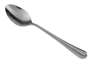
After much discussion (and more than a few ‘Why are we talking about this again?’ sighs) we settled on a few things. In a way, we define a spoon by its ability to fulfill a function – a handheld tool for scooping and stirring. You could use something that we wouldn’t call a spoon, say a baseball cap, to scoop and stir. But that doesn’t mean we would call the baseball cap a spoon!
Leaving the more difficult conversation surrounding the nature of names, symbols, and even the discrete distinction between things in reality aside, we had found a small foothold to work from – defining through purpose. A spoon, it seems, is the physical manifestation of a concept. The result of needing an object to fulfill the function of handheld scooping and stirring. And more specifically a spoon (as opposed to a baseball cap being used like a spoon) is an object designed with that function as its driving principle.
“Form Follows Function”
This line of thinking is what eventually led to the famous one liner associated with modernist architecture and industrial design: form follows function. That a thing, from a spoon to a skyscraper, should derive its shape from its purpose or function.
Physical actions like scooping, stirring, cutting, shading, connecting, pushing or pulling serve as solid foundations for the design of an object’s form. Factoring in real-world physical forces – compression stress, tension, shear, brittleness, bending strength – we can get a pretty clear idea of how thick a plastic spoon’s handle should be to avoid easily snapping.
Similarly ergonomics – our understanding of the human body and how to optimize its interactions with other parts of a system – gives us another filter to narrow down an object’s form. A spoon’s handle has a direct relationship to the shape of a grasping human hand, because to perform its function well it must be comfortable to hold.
This sort of design thinking – how best an object used by a human can serve a physical function(s) under physical constraints – has literally shaped most of the objects we interact with every day. It has been an unquestioned driving force behind most 3D industrial design since we first started sharpening sticks and rocks.

Ergonomics + Physical Functions + Physical Constraints
Designing Nonexistent Objects
And then along comes virtual reality. An inherently 3D medium requiring designed virtual 3D objects, but without the limitations and guidance of physical functions. Or physical constraints. What then makes a spoon a spoon in VR? Or in other words, what allows a spoon in VR to perform its function of being held, scooping and stirring?
Let’s look at scooping and stirring first. Suddenly the spoon’s shape becomes much less important. Import a 3D model of a spoon into Unity and you’ll be able to see the mesh in full 3D but it won’t do much else. To use its shape to scoop and stir we would need to involve a physics engine. We could assign the spoon a rigid body and some colliders to approximate its shape and then do the same for anything we’d want the spoon to interact with. All this and we’d still have a rather clunky spoon, capable of crudely pushing around other rigid objects within the physics simulation.
Let’s say we want to use the spoon to scoop some ice cream into a bowl. It’s possible using only physics simulations, but this is ridiculously inefficient. We would need to use things like softbody simulations or particle-based systems which are extremely computationally expensive.
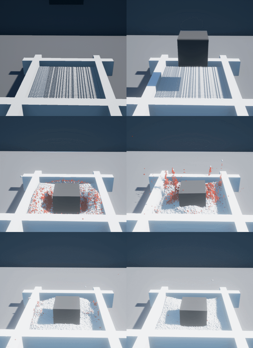
Instead, we might want to look at what we’re trying to achieve with this virtual spoon and then use the tools within the game engine to achieve that goal. For instance, we could write a script which would attach a scoop of ice cream to the spoon when it entered the tub trigger zone, and drop the scoop when the spoon entered the bowl trigger zone.
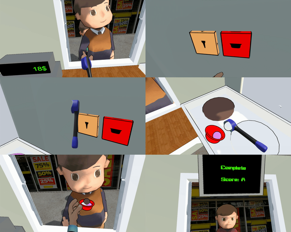
‘Scoops’ by Reddit user /u/Cinder0us
In this example, the spoon’s shape (or mesh) is completely separate from its function of scooping and stirring, which is handled through scripts and trigger zones. We could replace the spoon mesh with a teapot mesh and it would still function the same (though that would be really weird). In VR, unless we’re using only physics simulations, an object’s form is completely divorced from its function.
So then what should the driving force behind virtual object industrial design be? What should virtual form follow?
Well let’s look at that third function of our physical spoon – being held. There are many ways we could handle grabbing a virtual spoon within a VR experience. From the crudest, touching the spoon snap attaches it to your hand/controller, to an extremely nuanced simulation of real-life grabbing as detailed in building the Leap Motion Interaction Engine.
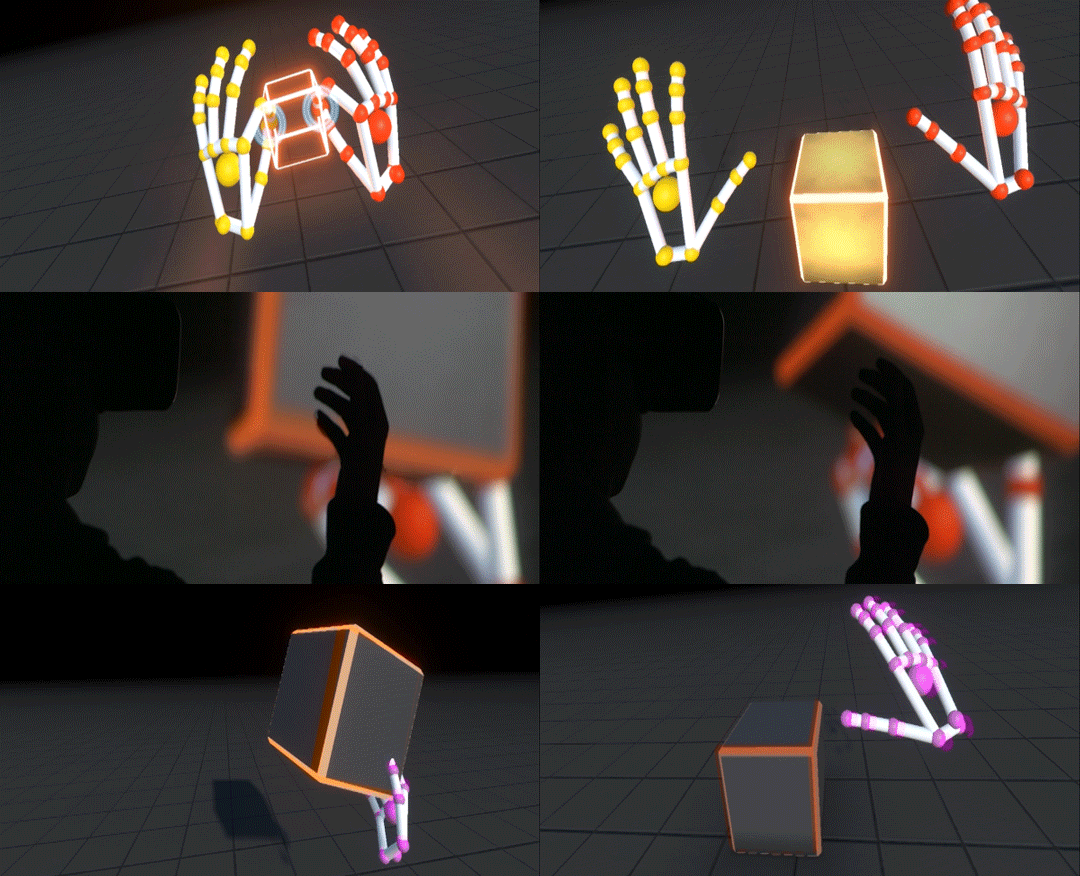
Leap Motion’s Interaction Engine allows human hands to grab virtual objects like physical objects
Once again, however, the shape of the virtual spoon doesn’t actually allow the grabbing to occur. It’s still handled through scripts and approximated colliders. But there is one very important role that the virtual spoon’s shape does fulfill – it signals to the user that it should be able to be picked up. And how does it do that? There are two closely related terms which might offer some guidance: skeuomorphism and affordance.
Skeuomorphism
Skeuomorphic designs are ones which retain ornamental design cues from structures that were necessary in the original design. For instance, using a postal mailbox to represent an email inbox or an envelope to represent an email. In VR, skeuomorphism is instantly appealing since, unlike with desktop or mobile, we don’t have to abstract 3D objects into 2D. We could actually recreate the mailbox as it exists in the physical world – complete with physically simulated hinges and collisions and physical envelopes representing email inside.
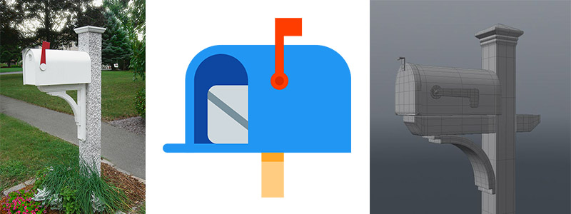
A physical mailbox and examples of 2D and 3D skeuomorphic representations.
Job Simulator by Owlchemy Labs is a great example of skeuomorphic VR design. The entire premise of the experience is to simulate (in a cartoony, videogame way) real environments and props. It works incredibly well as an intuitive experience for new VR users. Once they’ve figured out how to pick things up using the HTC Vive controller’s trigger, users are off to the races. They don’t need to be told how to use the phone in the office level. They just grab it and hold it to their ear the same way they’ve done hundreds of times with a real phone!
However, despite the advantage of instant familiarity when skeuomorphism is used as a primary design methodology, it’s limiting – even in VR where we can recreate physical objects in full 3D. When understood in reference to real-world counterparts virtual objects will never be able to fulfill all of the expectations users have.
For instance, in building Job Simulator, developer Devin Reimer estimates it took 500 hours alone to make the liquid subsystems work convincingly. Approximating heat transfer from hot and cool liquids, mixing colored liquids together and allowing users to slosh them around took a huge amount of development time and this was only to meet the minimum cartoonish requirements for believability. As Alex Schwartz, CEO of Owlchemy Labs, said “Watching playtesters do a thing that they expect to work in real life and then seeing that it doesn’t, that’s how our to do list fills up.”
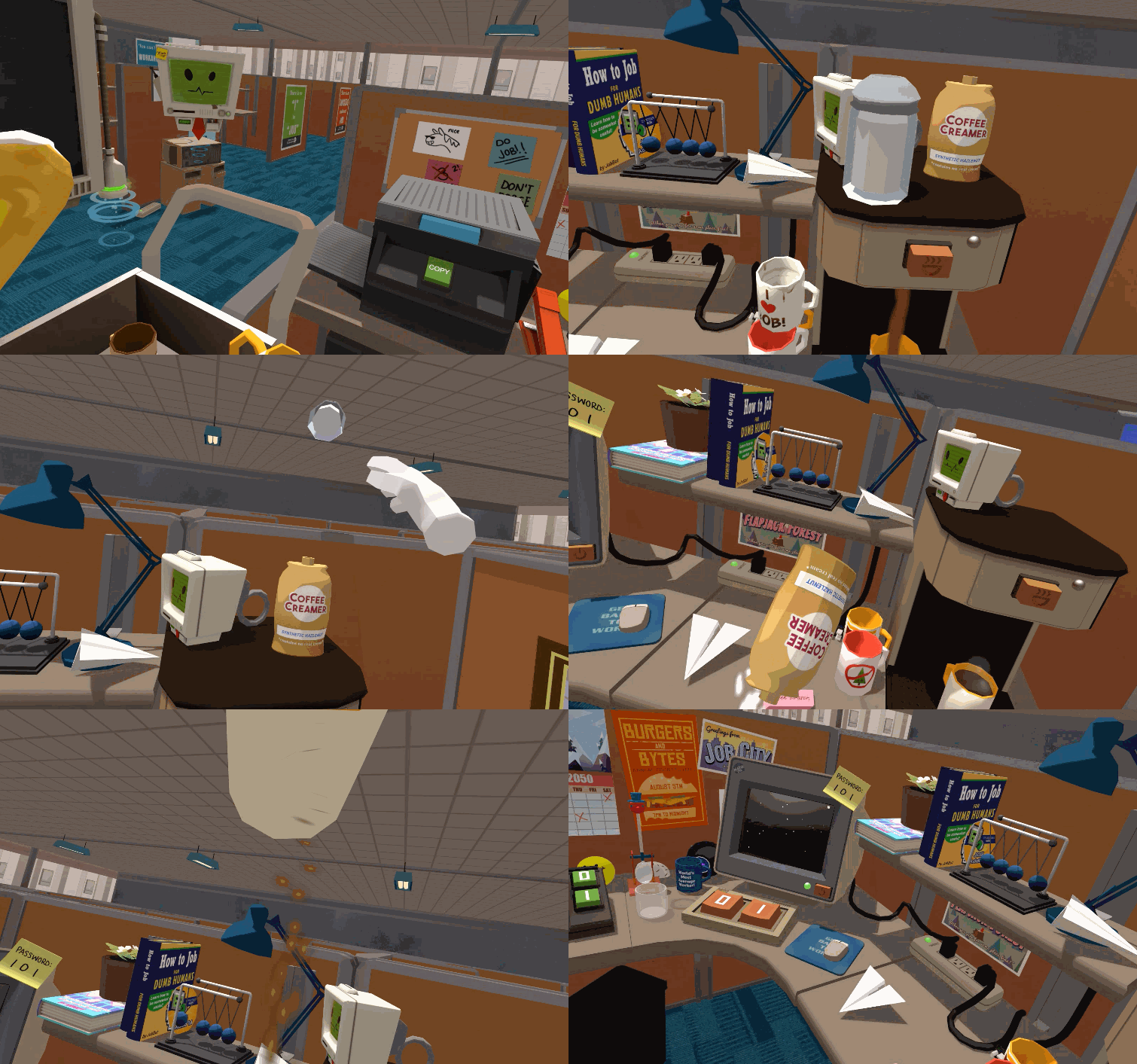
Job Simulator by Owlchemy Labs and their liquids subsystem
Using purely skeuomorphic design in VR casts the real world as an unattainable and unnecessary reference point for a medium with far more to offer. However, we also shouldn’t just ignore the physical world when designing for VR. Affordances are the critical functional component that designers need to graft from the physical world to create intuitive VR interactions.
Affordance
First defined in 1977 by psychologist James J. Gibson, and later popularized by Donald Norman The Design of Everyday Things, an affordance is “the possibility of an action upon an object.” For example, the handle on a tea cup affords the action of picking up the cup, just as the raised shape of a button might afford being the button being pushed.
Affordances are suggestions of actions a user could take. These suggestions are created by the sensory characteristics of an object. (It’s worth noting that an affordance refers to the relationship between the object and the user, not the specific components of the object itself.)
Physical interface elements like handles, buttons, switches, and dials – and the actions they afford – have been in use for centuries. As human beings, we understand them from an early age as we explore the physical world around us. Digital interface elements like scroll bars, clickable buttons, and more recently swipeable and pinchable elements have only existed for a very short time. When the personal computer was first introduced in the 1980’s, the desktop (even in name) and much later the first iOS were far more skeuomorphic than anything we would see on devices today.

The Macintosh’s desktop and earlier versions of iOS apps.
Skeuomorphism has been a necessary design stepping stone for teaching users how to interact with new technologies. It acts as a set of comforting training wheels for users as they begin to understand the language and patterns of a new platform. Today, the pace of new tech adoption has increased dramatically. Seeing children glued to screens at airports or in waiting rooms, it’s clear that swiping and tapping has become almost as common to them as grabbing a handle or flipping a switch.
We learn fast, but we are still in the early days of VR. We may again need to lean a little toward the skeuomorphic side of design to ease users into a virtual world which feels both exotic and familiar, new but filled with expectations from a lifetime of 3D experience. Our goal though should be to experiment to find new affordances native to VR which could not have been possible in the real world.
A great example of this is the ‘infinite backpack’ used in Fantastic Contraption. Once users pull a wooden strut out from over their shoulder the affordance is clear. Suddenly they’re grabbing and building much more efficiently than they ever could have in the real world.
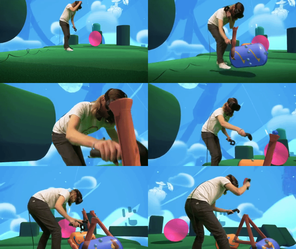
The infinite backpack in Fantastic Contraption
Thinking back to our spoon, how could its function of scooping and stirring be better fulfilled in VR? Perhaps, as with the struts in Fantastic Contraption, by pulling the ends apart a user could elongate it so that it could scoop and stir at a distance. Using known affordances like pulling – and evolving them so that pulling now allows something new like infinite material elongatation – is one way designers can leverage users’ experience with the real world to create intuitive yet magical moments only possible in VR.
Industrial design and architecture took their first steps into the virtual world with the rise of 3D games over the past couple of decades. However, aside from a few notable exceptions, they’ve been mostly representative. Set dressing for the real game of moving a character through an obstacle course. Now for the first time users will experience virtual objects and architecture 1:1 as they do real things and spaces. Perceptually the line between the physical and the virtual has started to blur and the distinctions will only become more fluid with the advance of VR and the rise of AR. Three-dimensional design has a blank canvas like never before in history.
We’ve already seen some really interesting explorations of this newfound freedom. Cabibbo’s gooey creations, Funktronic Labs’ pop-up work table and Frooxius’ Sightline: The Chair all take advantage of properties unique to VR. Satisfyingly reactive squishiness, holographic there-when-you-need-it-gone-when-you-don’t controls and messing with object permanence are just scratching the surface of what’s now possible.
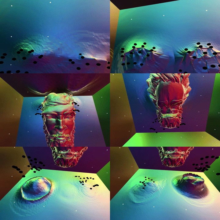
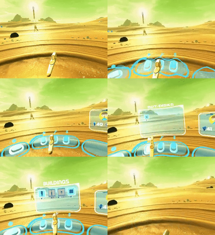
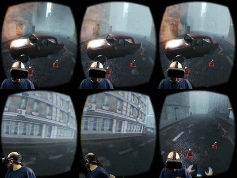
What can architecture become without the constraints of real world physical forces, gravity, materiality, light, acoustics, or even the requirements of staying static or Euclidean? What can industrial design become when there literally is no spoon (sorry, you knew it was coming)? I don’t know, but I’m excited to find out.
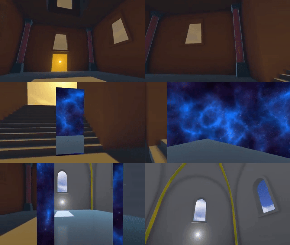
An example of impossible, non-Euclidean spaces in VR.
