Explorations in VR Design is a journey through the bleeding edge of VR design – from architecting a space, to designing groundbreaking interactions, to making users feel powerful.
All the world’s a stage, and you are now its set designer. Click To TweetDesigning the stage where your users will play is an incredibly important part of VR. Like an architect or a set designer, you have the power to create moods and experiences through a physical environment. How you structure that space will depend entirely on how users can interact and explore it.
Explore our latest XR guidelines →
Physical Structure and Human Expectations
Your space will typically have foreground, middleground, and background elements. The right balance can create a spine-tingling sensation of presence and guide your user. The foreground includes objects and interfaces that you can interact with directly. Your hands always occupy the foreground.
Within the middle distance of the scene, there may be elements that you can bring into the foreground, or which frame the environment. Finally, the background (or horizon) establishes the broader world where your experience is set. (For a more in-depth look at these three layer depths, see Tessa Chung’s posts Making Sense of Skyboxes in VR Design and How to Design VR Skyboxes.)
In his book The Ecological Approach to Visual Perception, James J. Gibson breaks terrain features into eight categories – opening, path, obstacle, barrier, water margin, brink, step and slope. Each feature is a building block that affords different responses.
- Ground can be open or cluttered. Open environments let you move in any direction, while cluttered environments guide locomotion through openings.
- Paths afford motion between other terrain features.
- Obstacles are human-scaled objects that afford collision.
- Barriers, such as walls, are a kind of obstacle that tends to block vision as well as movement.
- Water margins prevent locomotion.
- Brinks, such as the edge of a cliff, are dangerous. Users will either avoid these places or plunge into them with reckless abandon.
- Steps afford both descent and ascent.
- Slopes also imply descent or ascent, but might be too steep or slippery.
#VR world designers, how will your reality will be experienced at a human scale? Click To TweetIn developing your space, you can also think about how it’s experienced at the human scale – in terms of attention, structure, and affordance. As you move your gaze through the scene, where does it land? Where do you focus? How does the structure of the space around you make you feel and how does it influence you to move? How do the objects and scene elements you focus on communicate their purposes and statuses? These questions are informed by the physical structure of the space, and in turn identify problems (and potential solutions) with that space.
Prototyping Your World
Depending on your concept, world design may not be your first consideration. For example, the main focus in designing Blocks was the core interactions – pinch and grab. On the other hand, world design was the starting concept behind our spaceflight prototype VR Cockpit.
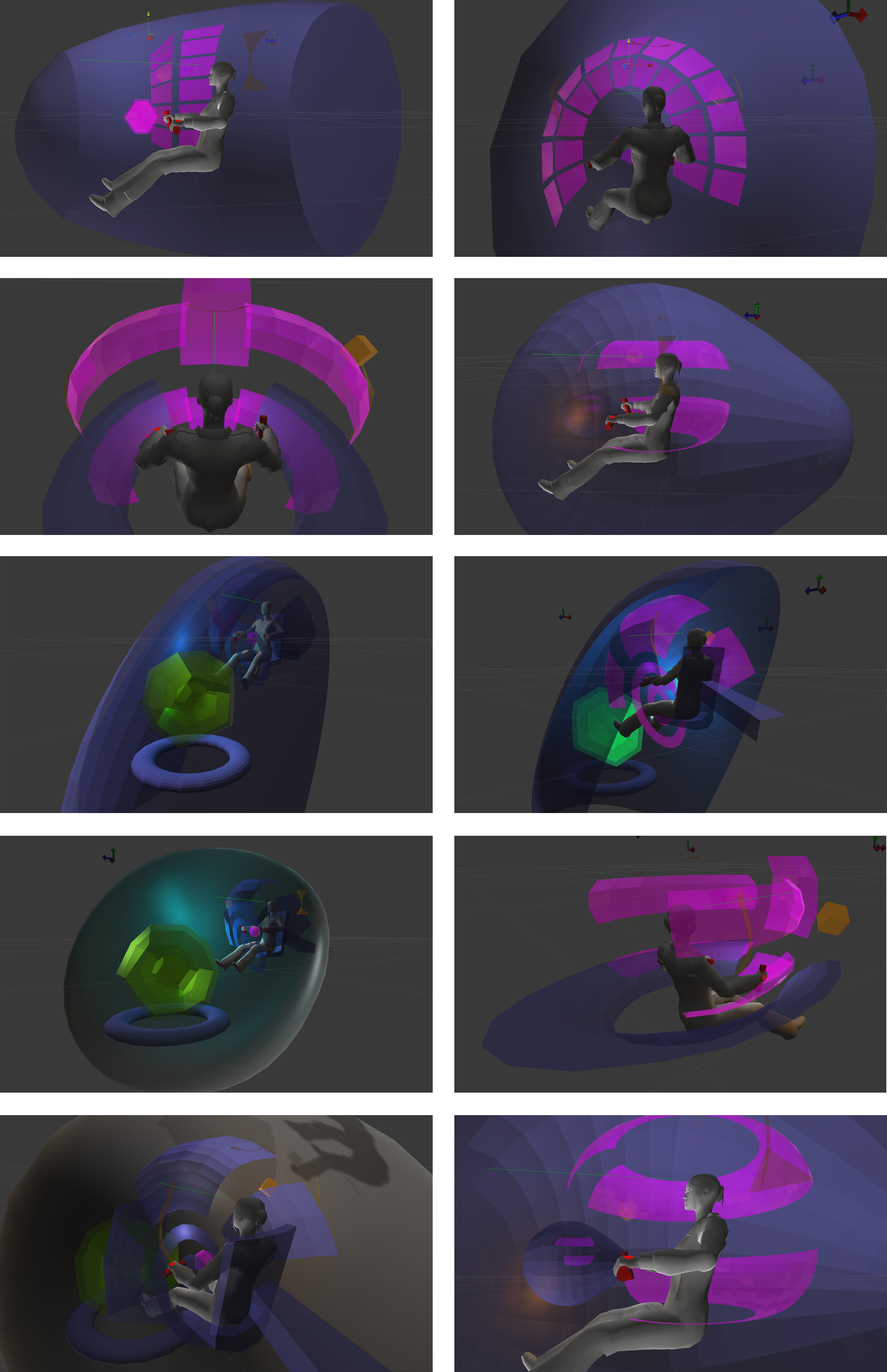
Real-world cockpits are incredibly complex, and we wanted to provide the same wonderful sensation of flight with a more streamlined set of interfaces. We already had the buttons and sliders and text displays as assets from earlier projects, so we needed an environment where these could be taken to a whole new level. As a result, we prototyped spaces first, rather than interactions.
To create VR Cockpit, our team rapidly designed different geometric models in Maya and exported them to Unity. With this approach, we were able to quickly experience and iterate different console styles. We ultimately chose a design where the consoles are curved, reflecting how your arms naturally swing in a radius.
The Training Room in Martin Schubert’s Weightless: Remastered was similarly driven by the need to house a particular experience – throwing objects and destroying targets.
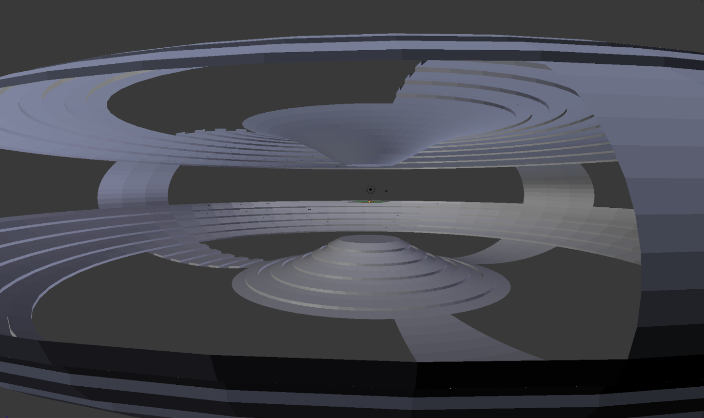
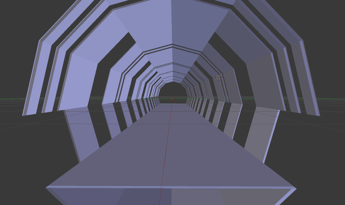
After trying some 360° environments, he quickly found that the extra space was a distraction, as the targets were scattered. On the other extreme, linear tunnel-like spaces that focused the user’s view forwards caused the projectile to bounce around too much. Ultimately he converged on a very wide cylinder. This gives the user 180° of open space, with targets both above and below the platform they’re standing on.
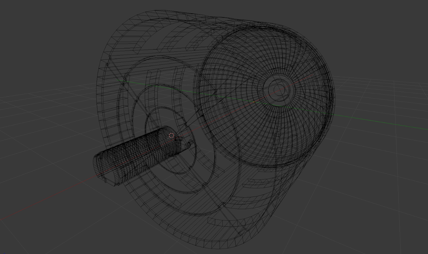
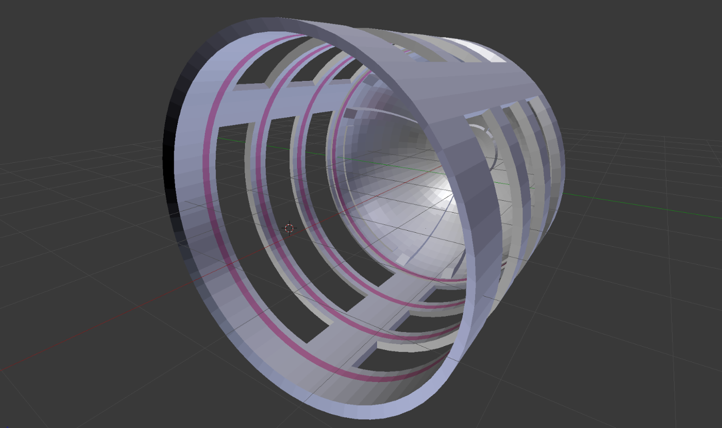
The final result was an open space where the user’s attention is funneled towards the targets:
TFW something looks great on a monitor, but feels weird and claustrophobic in VR. #VirtualWorldProblems Click To TweetThe key lesson here? Prototype, test, and iterate. We’ve often encountered spaces and sets that look great on a monitor, but feel weird or claustrophobic in VR. There is no substitute for actually getting your eyes into the space and looking around.
Explore our latest XR guidelines →
Next week, we’ll take a look at one of the most dangerous words in the English language – “intuitive.” Plus a deep dive into the creation of Blocks, and what it all means for the future of VR/AR.

