“The art of teaching is the art of assisting discovery.” – Mark van Doren
In this post, we’re taking a look at different approaches for introducing Orientations and Tutorials into Leap Motion apps.
With the introduction of the Leap Motion Controller, we’re unlocking a more natural and intuitive way for people to interact with computers. It’s completely new and downright mind-blowing — the first time ever that users have the power to control an experience with nuanced hand and finger movements in three dimensional space.
Yet, while consumers have had a basic introduction to motion control in some contexts (e.g. Kinect and the Wii) this is an entirely new experience for them as it relates to their everyday machines. Interacting in this new way can take some getting used to – and ensuring that you give users a proper understanding of exactly how to interact with your software will mean the difference between a magical experience and one that might leave users frustrated or confused.
There are a few different ways to approach the task of guiding users and teaching them specific interactions within your apps:
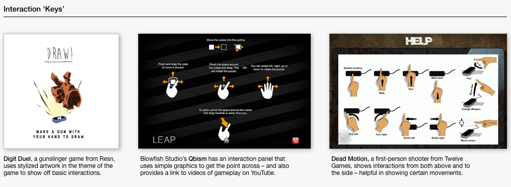
a. Interaction ‘Keys’ – discrete screens (shown either before starting an experience or accessible via a ‘help’ or ‘info’ menu) that outline all of the basic interactions and controls used in an app. It can be great to see everything in one place – but diagrams used need to do a good job of demonstrating both context and action. Even better, simple animations can go a long way in helping users immediately grasp the difference between discrete controls.
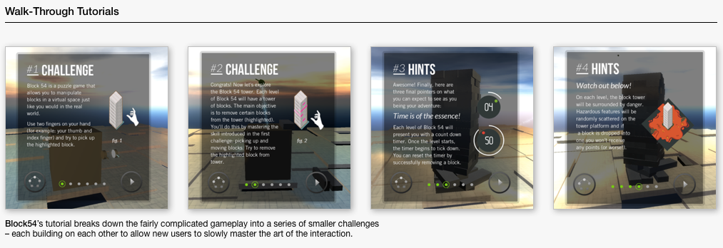
b. Walk-Through Tutorials – a series of screens, directions or interactive tasks that lead new users through each different part of your app. Often times, breaking more complicated interactions down into discrete parts can be a great way to introducing new users to the mechanics of your software. And, as always, letting users learn by doing is a great way to help them master controls in a safe environment and ultimately bolster their confidence as they dive into your app.
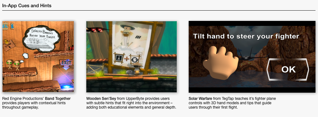
c. In-App Cues / Hints – Giving hints or cues to a user while they are interacting with your software can be an elegant way to subtly direct behavior. Simple contextual graphics paired with instructions (e.g. a pointing hand + “Tap to Select”) can go a long way in guiding users in the right direction. It is important, however, to make sure that these cues are as unobtrusive as possible and only support the experience vs. distracting from it.
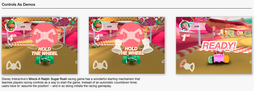
d. Controls As Demos – an experiential approach to teaching interactions by requiring users to perform certain tasks in menu selections or basic app control. This is truly ‘learning by doing’ and can be a creative way to reinforce gestures that are core to your app. Of course, these must ultimately be fairly intuitive – lest users require a tutorial to understand a home screen menu!
In every case, it’s a good idea to consider the advice provided in our general UX Guidelines: “Imagine that your user is faced with no instructions or tutorials on how to use your application. Strive at all costs to make their first intuitive guesses the right ones. Where appropriate, create more than one proper way to do something.”
From there, just make sure that users are always provided with direction, visual cues or feedback to appropriately guide them to feel in control of their experience with your software.
We’ve collected a few examples of orientation and tutorial approaches we’ll post below, but we are sure there are more that you all have to share. What are some of the most elegant solutions you have seen being developed for the Leap Motion Controller?


