UX design is a neverending learning process. Over the past year, we’ve been iterating on our UX best practices to embrace what we’ve learned from community feedback, internal research, and developer projects. While we’re still exploring what that means for the next generation of Leap Motion apps, today I’d like to highlight four success stories that are currently available in the App Store.
Games are boundless “safe zones” where developers and users can try out novel interactions and experiences that defy convention. Unlike utility apps, which are task-oriented, the game player’s goal is to play and experience something new. This is perhaps why some of the most compelling Leap Motion apps are games with cool interactions.
1. Keep core interaction simple
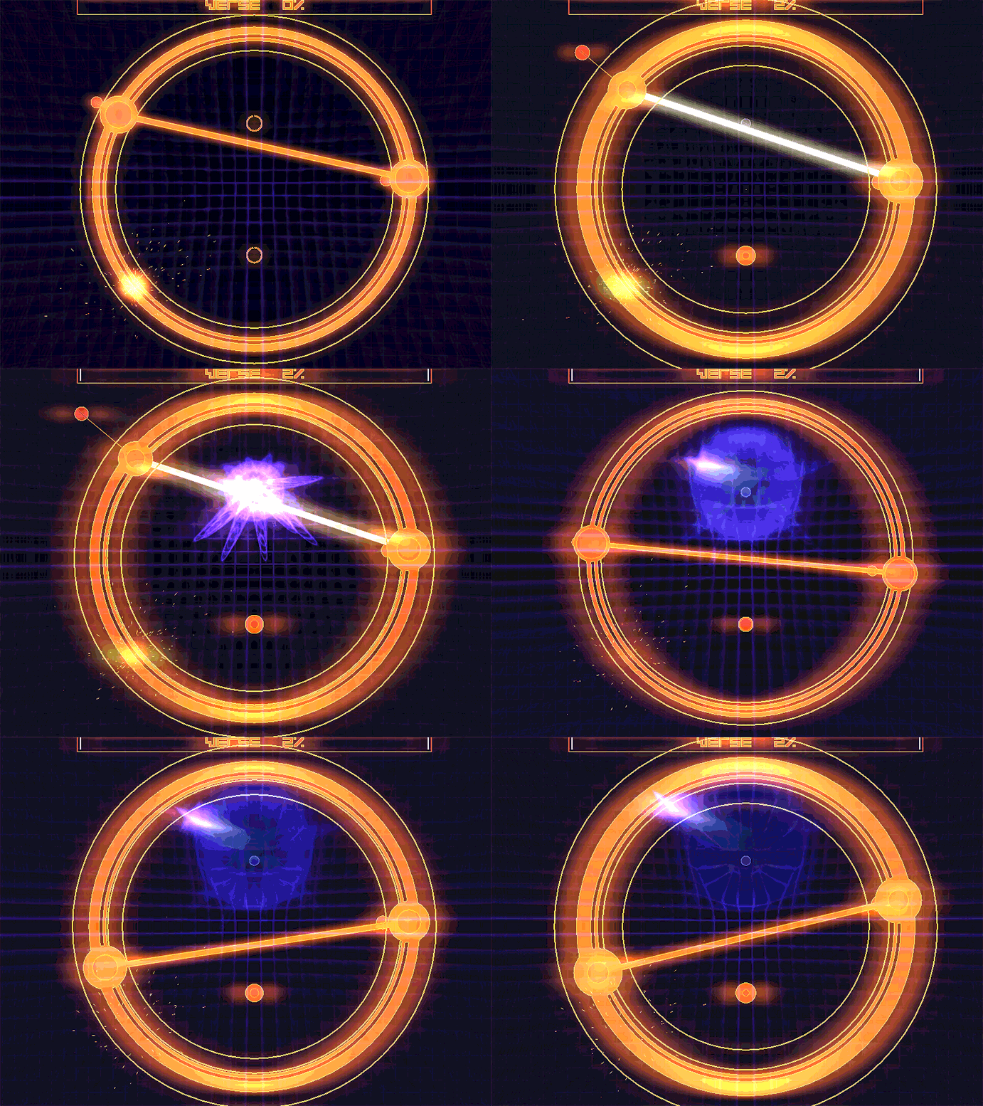
One of the most popular App Store games, Dropchord focuses on a single unique interaction – using two fingers to control the line between them around a ring. This interaction cannot be accomplished with the mouse, making it a unique experience. Even the main menu uses this two-finger interaction.
It’s always a good idea to keep the number of novel interactions to a minimum. Your users already have to climb a learning curve to use the controller and may feel overwhelmed by too many layers of new learnings at once. This barebones approach – a single line connecting the fingertips – also means that the player doesn’t need to focus on unimportant details. Instead of trying to control the exact position of their fingertips in 3D space, they can focus on the line and have fun.
2. Bring a familiar 2D game into the third dimension
Reimagining a classic game offers the chance to combine familiar elements in a whole new way. The trick is to bringing it into the third dimension in a way that makes sense and improves on the original.
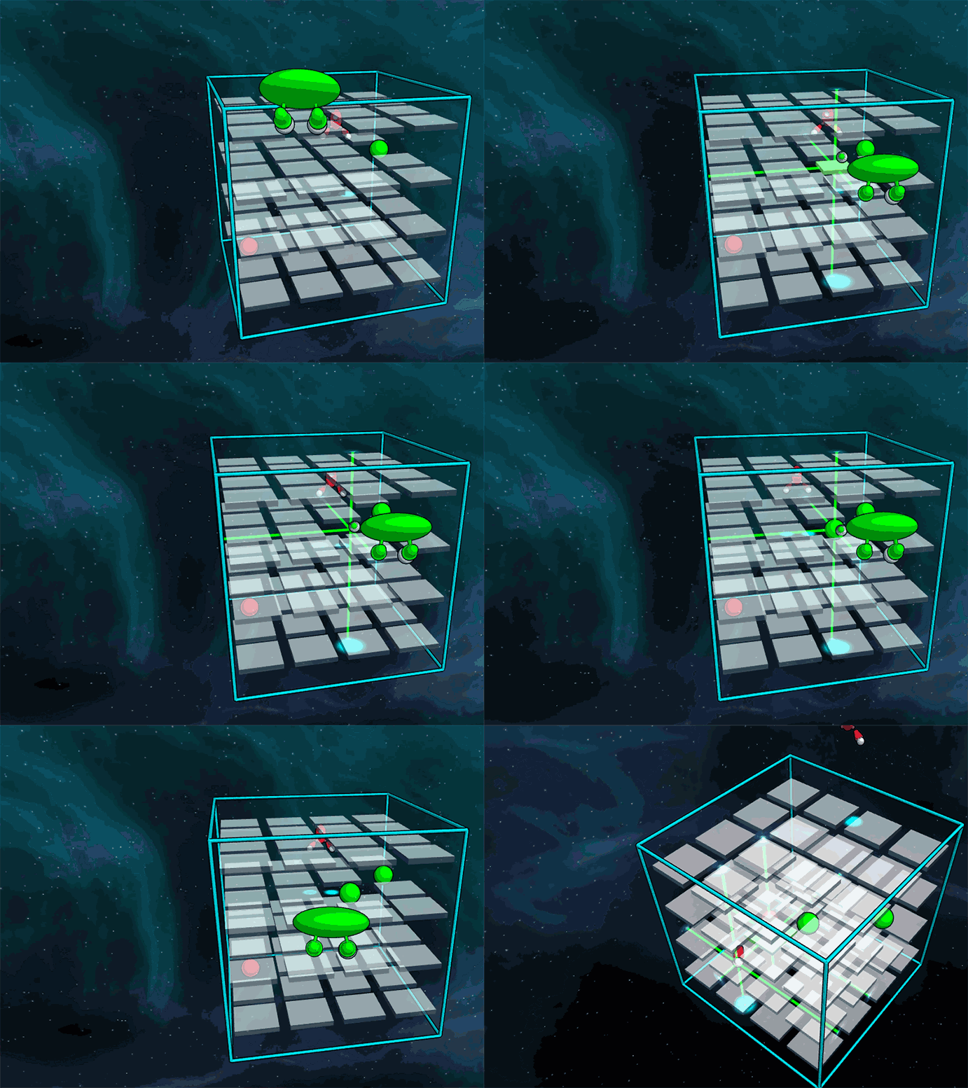
In the 3D tic-tac-toe puzzle game Derigo, your hand can easily switch between pointing and camera controls. Conceptually, Derigo is based on a classic 2D game, lessening the learning curve for new players despite the added challenge of 3D play.
3. Play to the controller’s strengths
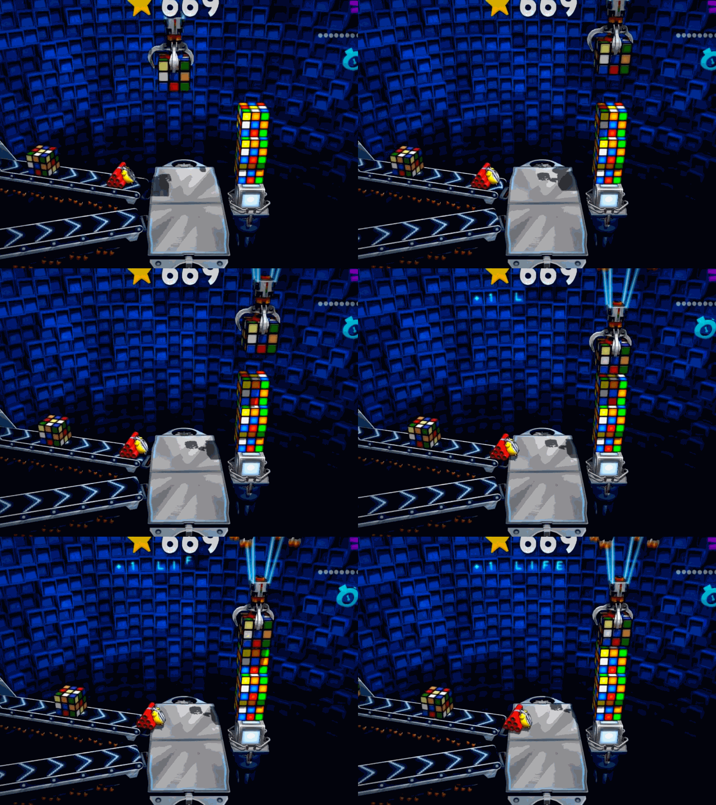
Designing for any new platform means being aware of its strengths and weaknesses. In Skyward, the player controls a claw with their hand; this maps well to a hand and takes advantage of the Leap Motion Controller’s tracking accuracy for downwards-facing palms. The grabbing gesture used to close the claw is also easy to learn.
4. Fun doesn’t have to be precise
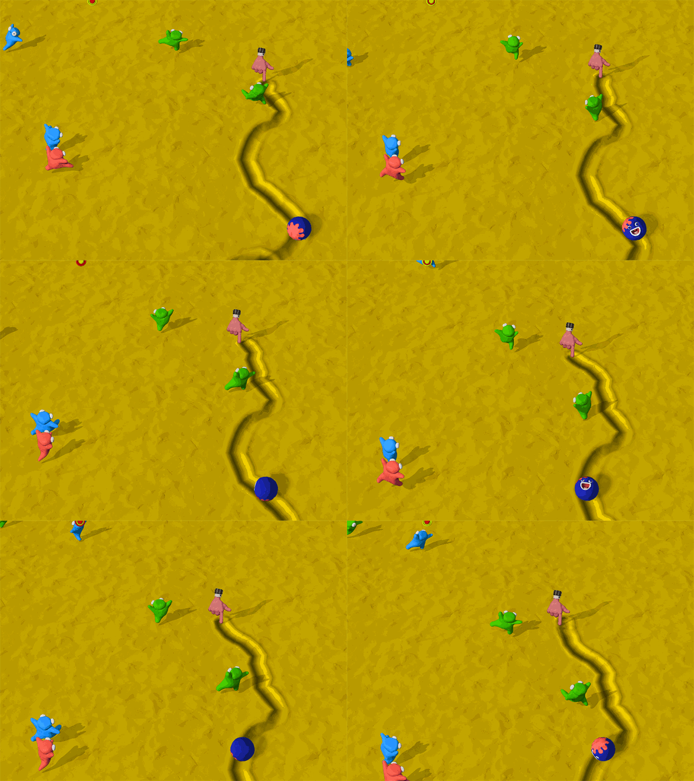
In the runner game Clay Jam, players continuously draw a trail to guide a rolling ball through the level. This embraces the motion-tracking dilemma of the sensor always being on, and because of the game’s speed, the player doesn’t need to be extremely precise in order to succeed. The game is forgiving of the player’s mistakes.
Clay Jam’s gameplay experience is augmented by playful music and audio feedback on top of a unique visual style – hand-made stop motion. Clay Jam is also built for tablets, but the hand occludes touchscreens, making Leap Motion control the better fit in this case.
In the coming weeks, we’ll be talking more about the latest interaction models and UX best practices that you can use in building your own gameplay experiences. I’d love to know what you think V2’s more robust tracking and onscreen hands will mean for the next generation of Leap Motion games – let me know in the comments!
Update 9/12/2014: The Airspace Store is now simply called the Leap Motion App Store.


[…] as designers to craft new experiences geared towards virtual platforms. Building on last week’s game design tips, today we’re thinking about how we can break real-world rules and give people […]
June 13, 2014 at 7:49 am[…] out a few prototypes, however, the team encountered roadblocks when attempting to tackle the uncanny valley of a reliable Z-axis in the context of a traditional desktop […]
June 18, 2014 at 11:38 am[…] one interaction at a time. In a previous UX post, we talked about minimizing the number of novel interactions in your app. If you must have more, […]
June 27, 2014 at 9:30 am