With Airspace now open for submissions and launch just around the corner, we want to take the opportunity to share thinking and great examples from throughout the developer community in order to bring our existing User Experience Guidelines to life. We’re seeing some incredible content being developed and want to spread the wealth – so over the next few weeks we’ll be sharing thoughts, screenshots, videos and even example code. This can hopefully inspire some good conversation – as well as development of your own software.
For our first post, we want to take a step back and talk about Building Complete Application Experiences.
Beyond simply looking great and performing well, we want to make sure that every Leap Motion-enabled app available in Airspace is a truly self-contained user experience. In additional to core functionality or gameplay, there are a few additional things to consider when evaluating user experience:
a. Make a Proper Entrance – Set the stage and introduce users to the app experience. Use splash screens, content animations or environmental cues to get an app off to the right start.
b. Orient Appropriately – In addition to making your software easy to use and understand, be sure to provide clear instructions regarding controls. These can be featured on their own or contextually within the experience, but should always be accessible if the user needs help.
c. Put Users in Control – Provide all necessary menus, settings and controls in order to let users be the masters of their own experience. Don’t be afraid to use every opportunity, including menu navigation and selection, to reinforce interactions that are integral to your core functionality.
d. Exit Gracefully – Don’t force anyone to stay longer than they’d like. Ensure that users have a quick and seamless way to always pause, go back or exit your application.
Of course, not all of these apply to every application – for instance, high-frequency utilities shouldn’t present barriers to use in the form of lengthy introductions or splash screens – but it’s worth thinking through each in regards to any application and determining whether they would ultimately improve the experience.
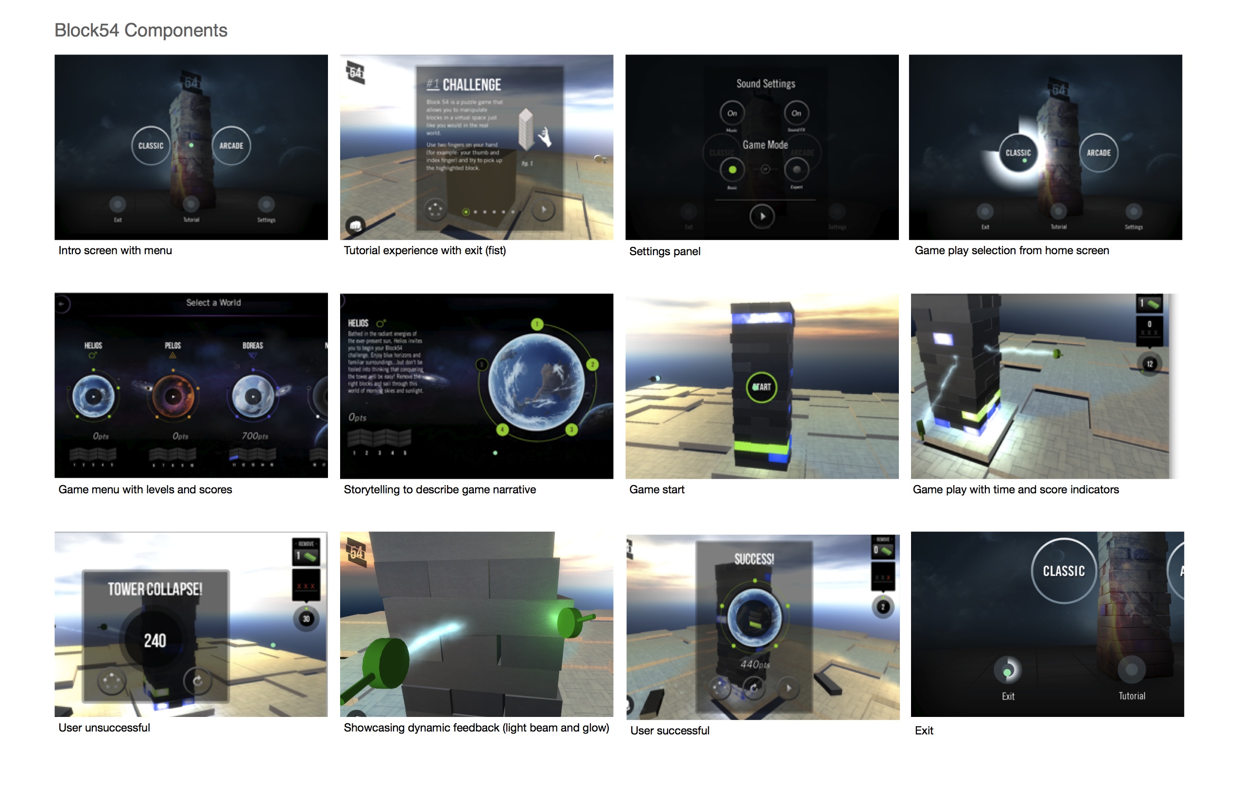
One great example of this is Block 54, being developed by theLIFT. Sure, we’ve all seen the core gameplay in this app – but the team has been working hard to build out additional components of the experience that really help round it out: splash screens, a basic tutorial, multiple worlds, stage-setting copy and even different difficulty settings. A sneak peek of some of this is here – have a look!

What else is important to think about in developing what you would consider a ‘complete’ app? We’d love to hear your thoughts (or even pet peeves) and see examples from the projects you’re working on.
