 Creating interfaces is really difficult. It’s especially difficult when you are making interfaces for something that has not been researched before. The way you interact with the computer is different if you are using a trackpad, mouse, or touchscreen – and especially a Leap Motion Controller. Some actions are easier, and others are harder, so each interface should be made with these restrictions and freedoms in mind.
For the Circle of Aww demo (which you can see on my website, CSS3D required), I wanted to try creating an interface that used only the gestures given to us by the leap.gestures array. I really think that a 3D input device requires a 3D interface, while information is still easier to consume in 2 dimensions. In this way, I believe that navigation in 3 dimensions, and consumption in 2 dimensions, is probably the best approach to creating an interface.
The other key to creating an interface is that, in most cases, the best interface is the one you don’t notice. This is the interface of an application whose primary concern is the consumption of information. Any step between the user and the information is blocking the consumption of that information, and will only frustrate users.
This is what makes something like Twitter so brilliant. Not only is the information available without any extra clicks, but it actually does away with any navigation, because even by navigating further back in time, you are actually consuming information while you do it. This ‘Navigation is Consumption’ philosophy eliminates any time where the user is not consuming information – meaning there is even less space between the user and the information.
In the Circle of Aww, I wanted to create some sort of ‘Navigation is Consumption’ interface, while still allowing the user to focus on a single object if they wanted to. Because of this, I created the spiral. You can quickly glance from picture to picture as they fly by you, but if you want to select a specific image, it permits you to do that as well. The controls attempt to be as simple as possible. In fact, all you have to do in order to move forward and backward through the spiral is to simply circle.
In order to make it so that the images could be selected, I used the z-axis. In this way, the image that is the closest to your hand as it moves in and out of the field is be the one that is ‘selected.’ This allows the user to quickly skim through images, and be able to focus on one specifically. The user can select a different object by moving their hand forwards or backwards while keeping their fingers spread open.
While I would spend much more time finessing this part of the interaction if I wanted to turn this into more of a full-fledged app – rather than another experiment – I am pretty happy with it as a new test. There are a few aspects of the design that make me believe that this interaction has potential.
One promising design aspect is how the spiral slows down rapidly when the user spreads their fingers. This sort of feedback is helpful, not only because it stabilizes the images for selection, but it also lets the user change from state to state without changing the position of the palm. This is extraordinarily helpful when trying to stay at a specific z-index, because then a user can select the picture they want, close their fingers, and be able to use their finger to tap without having to worry about selecting a different picture.
In the Circle of Aww, a user does a ‘screenTap’ to bring an image to the center, and a ‘keyTap’ to return it to its position. I would probably use touchZones for selecting these images now, but the screenTap and keyTap work decently, especially because you don’t need to worry about changing images while trying to do these motions.
All in all, I enjoy using this interface, and think it has a lot of potential. It may put a bit more distance between the user and the information than something like Twitter does, but it’s so much fun to fly through a spiral of puppies that I believe it makes up for this distance. It feels ‘fun’ to use while still remaining useful. Experimenting with new shapes of interfaces is extraordinarily exciting, and I think a spiral is an especially elegant one. Even though there are still some bugs, its a great way to start thinking about new ways of connecting with your computer.
As always, I’d love to hear what you think about the interface, and more importantly what you have been creating as far as experimental interfaces go. Let me know in the comments, on Twitter @cabbibo or via email icohen@leapmotion.com.
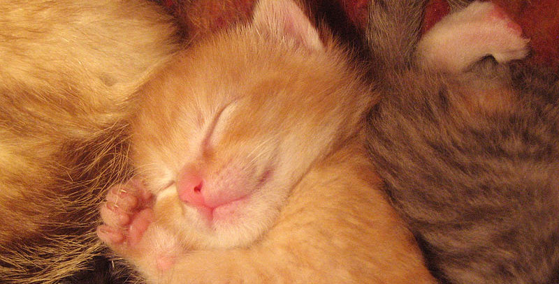
TL;DR: Puppies, kittens, and more puppies. Also navigation as consumption.


[…] of learning how to meld mixed media with emerging tech in ways that will spring humanity forward, induce awe, and spiral our collective consciousness into new frontiers. It’s a maker’s […]
July 8, 2014 at 7:43 am