Old habits can be hard to break. When I’m building Leap Motion prototypes, I often find myself slipping into designing for cursors and touchscreens – paradigms based on one-handed interactions. By remembering to think outside the mouse, we can open ourselves up to interacting with virtual objects using both hands. But when are two-handed interactions the right approach?
Two hands for additional controls
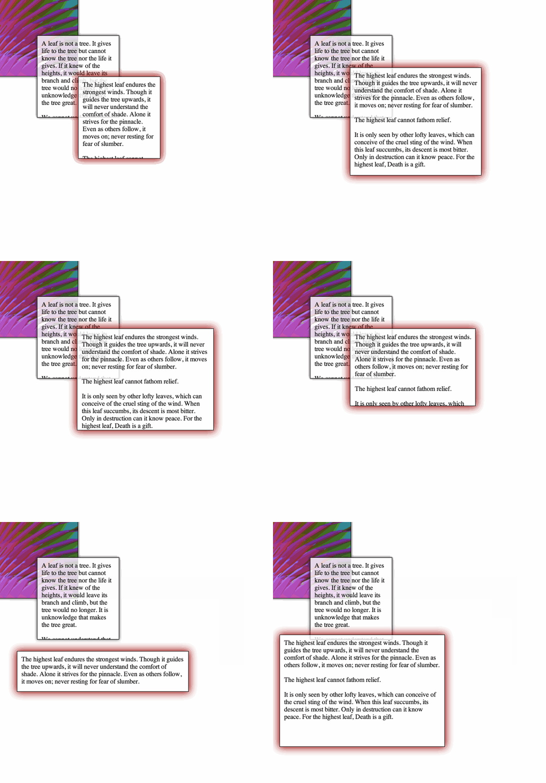
If your app is largely based on single-handed interactions, bringing in a second hand is a deliberate decision that should map to an intentional action. For example, the animation below shows a basic textblock use case where two hands with extended index fingers can be used to resize the text block.

This approach traditionally requires a very precise cursor to drag the corner of a resizable block. With motion control, two hands are better than one. Given that using a second hand can double the number of interactions, we can begin rethinking how toolbar UIs can be reinvented or even removed to take advantage of your hands’ numerous degrees of freedom.
Keep in mind, though, that using two hands continuously can be quite tiring. Ergonomics should always be considered so that users aren’t forced to elevate their hands in an uncomfortable pose for an extended amount of time.
Two-handed 3D manipulations

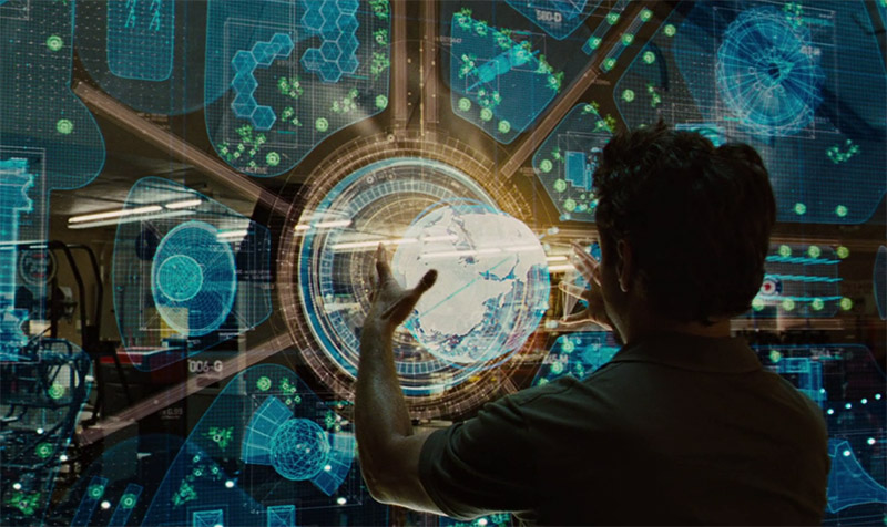
Virtual 3D modelling with motion control is a staple of recent sci-fi interfaces for a good reason – it feels natural to reposition, rotate, or resize objects with our hands. Using two hands for these physical manipulations is effective for gross or fine adjustments, and with the right design can be easy for new users to learn.
The role of each hand
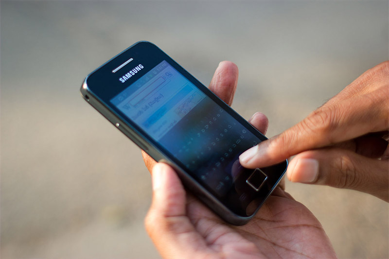
Both Xerox Parc and Microsoft have concluded that the non-dominant hand sets the context for the dominant hand. But what does that mean? As a righty, I write by using my left (non-dominant) hand to position the paper, and using my right (dominant) hand to grasp the pen and write with precise movements. The dominant hand operates relative to the frame of reference set by the non-dominant hand. This behavior can be seen everywhere – from washing dishes to using a smartphone.

How can we apply this insight to building Leap Motion apps? For one, interactions can be defined so that one hand controls gross movements while the other controls fine movements. A virtual clay molding app can have camera/object control in one hand and detailed sculpting in another.
With the v2 tracking beta, it’s now easy to determine whether a hand is left or right using hand.type. When designing for two-handed interactions, be sure to consider ergonomics and HCI research findings, such as how specialized roles for each hand become more important as tasks become more challenging. Finally, if you simply want to use two hands to interact with your computer, try a Leap Motion tool like GameWave to customize interactions for apps. Have fun!
Image credits: Paramount Pictures and Marvel Studios (Iron Man),Victorgrigas via Wikimedia Commons (phone)


I do some 3d data visualization of scientific data coming either from observations or simulations. I use programs like open dx or techplot that allow you to rotate, zoom and pan on the fly. How does the leap motion play with these or other similar programs?
July 4, 2014 at 8:16 pmHi, consider the Leap Motion as a THIRD input type (first is keyboard, second is mouse), that can do something the other two can not to and vice-versa. For a specific integration, the developers of the softwares you mentioned have to release a new version with native Leap Motion commands support. Until then, the only thing you can do is to write your own personal wrapper that converts your favorite hand/finger gestures (the wrapper is yours, you can choose 🙂 ) to mouse and keyboard patterns that you use to move the data into the softwares. So contact the softwares’ support teams and ask for Leap Motion integration (even if i think that they are already working on it…).
July 4, 2014 at 10:43 pm