As the 3D Jam approaches, developers around the globe are already getting a headstart on their projects. Zach Kinstner, the creator behind Hovercast and Firework Factory, has been sharing his latest project through a series of videos – a virtual reality guitar! We caught up with Zach this week to talk about his design process, especially the guitar’s unique combination of visual depth cues.

Stage 1: Building the Guitar
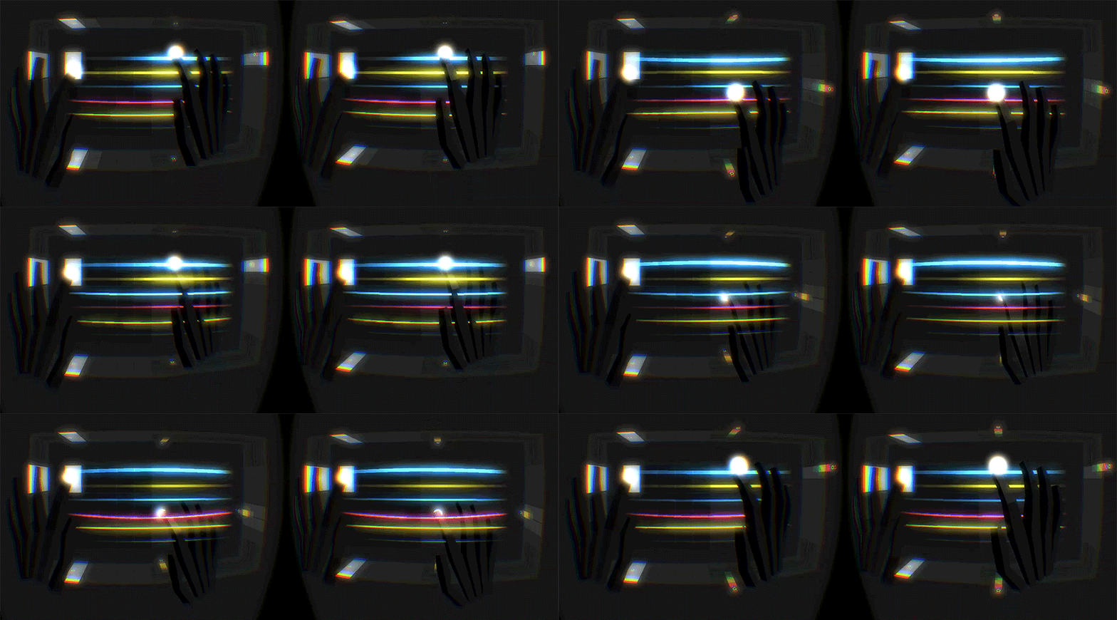
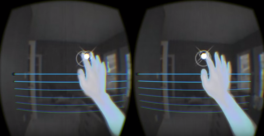
In this first video, Zach dives quickly into Unity, having set up the MIDI guitar sounds and attached them to some simple visual “strings.” He adds a visual indicator to the fingertips to help show the user where the hand is in 3D space.
What’s the importance of these visual indicators?
Visual indicators are very helpful for understanding where your hands are in virtual space. They can provide a good sense of depth, show which parts of your hand are being used for input, and help you discover which objects in the scene are interactive. (I wrote about this in more detail in my Hovercast blog post.)
For the guitar project, there’s a “strum zone,” which is basically a 3D rectangle. To strum the guitar, your finger has to be within that zone. In that scenario, I thought it was important – necessary, really – to give the user a strong sense of depth. The visual indicators are helpful for keeping your strumming finger inside of the zone when you want to hit the strings, and outside of the zone when you don’t.

These twinkles are the first in his visual clue experiments.
Why not just allow the hands at any depth to interact with the strings?
Without some depth restrictions, the guitar strings would make noise with just about any hand movement. While I’m not looking for total realism, I do want the strumming to feel somewhat natural. I play “real” guitar, so I’m using that experience as a general guideline. Sometimes you want to strum downward, or to strum upward, or to hit individual strings, or to move your hand without hitting the strings at all. The “strum zone” is a good way to achieve those goals.
Stage 2: Chord Selection
In his second update video, Zach added the ability to select chords using input from the user’s left hand.
What’s the thinking behind the chord selection design?
Working with 3D input devices like the Leap Motion, I try to find the simplest ways to accomplish a task, and also to utilize the strengths of the device. I have to consider which movements, poses, and gestures will work most reliably with the hardware, and how easily they can be learned by new users. I’ve done a significant amount of exploration with the “hover” interaction, and found that it works well, so I decided to try it for the chord selectors.
The layout of the chord selectors should seem familiar to guitar players. The selectors are arranged in a grid to match the first five notes of the first three strings. Essentially, you’re selecting the bass note of the chord, and the other strings update to form the full chord. I may also add the ability to switch between major and minor chord formations – possibly using the orientation of your hand or the “spread” of your fingers.
Stage 3: Additional Depth Cues for VR
When it comes to visual indicators in VR, there’s a delicate balance between being distracting and being easy to overlook. In the third video, Zach has added a few new types of visual indicators that hit this crucial balance.
Are you concerned that visual indicators on the edge of the screen risk causing distraction in the periphery of your vision?
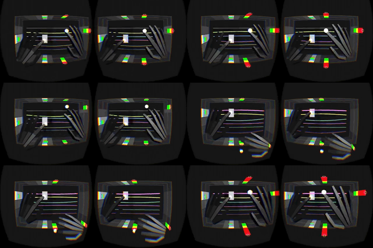
I see it the other way – placing them at the edges of vision helps avoid distraction. My first attempt at a depth indicator (in the second video) placed graphics on the front and back sides of the “strum zone.” This worked well for slow, deliberate tests, but not as well in an actual guitar-playing scenario. The indicators were too subtle to see clearly when moving quickly, and making them brighter or bolder meant more clutter in front of the strings and selectors.
You made several “layers” of indicators in this update video. Red/yellow/green ones to show depth and whether the hands are in the “strum” space. White highlight blocks to help show you where your chord hand was in space. And light grey blocks to show on the sides where the strings lined up.
That’s a somewhat complicated combo, yet it seems to work beautifully. What was your thought process here?
Thanks! So far, I agree – I think I’m on the right track with this latest concept. Wrapping the visual indicators around the “strum zone” allows them to be easier to see – or maybe, easier to perceive – without obstructing your view of the main interactions.
My goal is for the user to be aware of these visual indicators, and find them helpful, without really paying attention to them. For example, you might be focused on your chord selections, but with the flash of red near the edge of your vision, you immediately know when, and where, you have moved outside the “strum zone”.
Of course, the design of these indicators is still in an early phase. As I refine them, I anticipate that certain colors or shapes or sizes will be more effective than others, and that each “layer” will retain distinct visual cues. All of these elements need to be balanced properly to make this “complicated combo” work well.
For the latest on Zach’s VR Guitar, be sure to watch his 3D Jam project thread on our community forums. What do you think of the demo so far? Let us know in the comments!


[…] Zach Kinstner’s #DevUp video series, we’ve watched VR Guitar evolve from an elegant concept to a powerful instrument that uses […]
November 17, 2015 at 8:33 am[…] active. Setting user expectations with constant dynamic visual feedback is key. See, for example, Zach Kinstner’s VR Guitar project, which uses color cues to reinforce your sense of hands in 3D space: […]
January 7, 2016 at 9:12 pm[…] 现在的游戏开发软件都不支持进行手势交互设计,所以我们在制作VR过程中,会出现物理和交互反常的情况。比如用手去拾取一个物体时就会变得跟现实不太一样——大多数时候,因为模型的问题,手都在和物体还有空隙时就判定为接触了,有时手指甚至穿过了物体。这就要求设计师在设计和实现的过程中更加仔细一点。而纵观整个领域,当下最大的问题就是手势感应器需要一直开着。当用户使用鼠标或是触摸屏时,它们都会有一个很明显的激活/未激活的状态,因为它们都是通过物理元素(鼠标/触摸屏)来完成交互的。然而,用户在VR中时,手始终都是处于感应范围内,当下也没有一个合适的方案来自动切换手势识别的开关。通过动态视觉反馈来进行设置,是解决这个问题的出发点。比如,Zach Kinstner’s VR Guitar project ,在3D空间中根据不同的场景给予手部不同的颜色来增强用户的感知能力。 […]
February 15, 2017 at 7:02 pm[…] Zach Kinstner’s #DevUp video series, we’ve watched VR Guitar evolve from an elegant concept to a powerful instrument that uses […]
January 7, 2018 at 2:16 pm[…] Source link […]
January 9, 2018 at 5:47 am