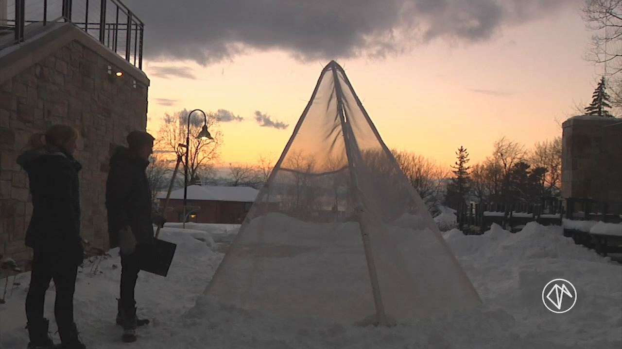
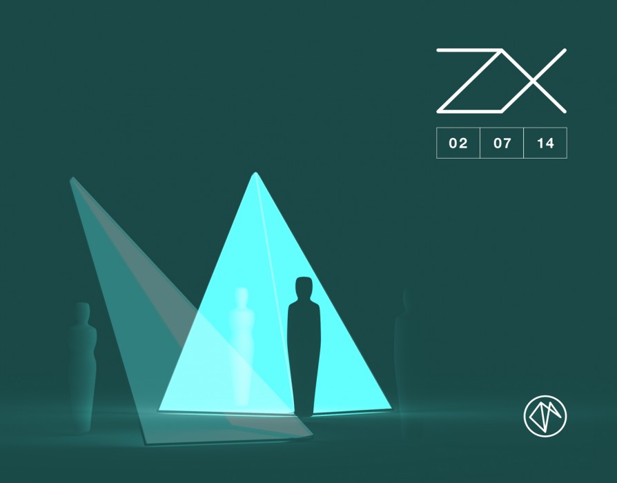
Earlier this year, visitors to Champlain College in Vermont discovered a strange shape emerging from the snowy campus courtyard. Created by Craig Winslow and Justin Kuzma, the duo behind last year’s immersive forest experience Growth, ZX is a 10-foot geometric structure that combines projection mapping with Leap Motion technology.
Recently, we caught up with Craig to ask him about how ZX was created, including its unique interaction design. By using visual and audio feedback, Craig was able to create a compelling experience where the interaction space of the Leap Motion Controller became as intuitive as touch.
Indoors and outdoors
The courtyard area at Champlain College stood out to me as an opportunity – to have a form which people could interact with from above, as well as observe. There’s a relationship between someone inside the installation outdoors, and the people inside changing the content.
Building the model
Knowing the model had to be simple, I went as simple as I could go, while still keeping it interesting. A square base, with one point raised, seemed to be simultaneously stable yet completely unstable, so I went with that. It’s also what inspired (and literally relates to) the project’s cryptic name.


Light and sound as interactive boundaries
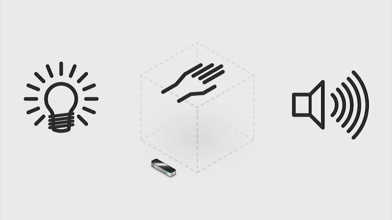
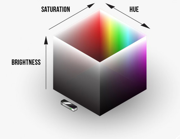
Since ZX was a concept piece, we cut it down to the basics – colors tracked to hand movements in a 3D space, and complementary sounds. We didn’t realize until halfway through coding it, that we had just created a tool that uses our perceptual sensory limits of light and sound (we can only see so bright, only hear so high a pitch) to demonstrate the boundaries of the Leap Motion Controller’s intangible interaction space.


This was something we struggled with in Growth. Many people kept their hands low over the device, thinking it was a button or small touch surface, and needed to be further prompted to raise their hand into an invisible space. Kids loved and got it right away, but adults needed coaxing. With ZX, it’s inherent that when you raise your hand, it gets brighter. Super basic interaction, but we found it was actually really effective.
Sound design
As you raise your hand up and down, you move through a varying harmonic scale. While it was inspired by the theremin, Nick Giordani (our sound designer) definitely sought to make a new instrument out of the experience, rather than something that needs training to use. Otherwise it would sound jarring and scary.
We also mapped certain sounds to gestures that are dependent on the height of your hand. A strong tone welcomes you where your hand enters the space, bells twiddle when you tap your fingers, etc. Hue pans left and right in stereo speakers, but we’re working on more advanced saturation/hue representation through sound modulation. More saturated color may have a more low-pass filter, while a desaturated one may have a slight more grain or noise applied to it.
An evolving project
I use the term ‘evolve’ a lot when describing ZX, because I can see its future to be non-linear – changing in form and function. We designed this to be modular, iterable, and portable. As a result, I see opportunities for ZX to grow and be installed in multiple locations, and vastly different directions.
I’m really interested to hear what other people see in this simple concept, and take advantage of opportunities to see it grow, change, and travel.


[…] ZX’s sound and visual design made the Leap Motion Controller’s interactive space as intuitive as touch. Learn more from the creator on Developer Labs » […]
April 24, 2014 at 11:23 am[…] ZX, Craig Winslow used light and sound as boundaries, designing the interactions so that both were […]
July 5, 2014 at 8:01 am